Friday, November 13, 2015

Lightfastness or just being silly......

An accidental study in light fastness.


Using and loving the Twinkling H2O's I remember a fellow student asking our teacher whether or not the twinks were light fast. She couldn't give an answer to that because she had not been testing it.
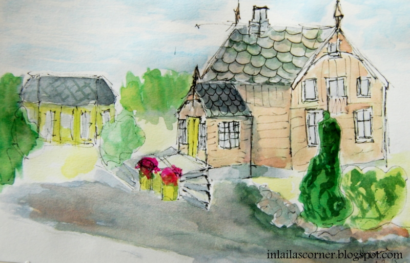
I didn't test it in purpose either, when my painting were done I sat it in a south faced window, meaning lots of strong light and sun. My painting has been sitting there for a year and a half, back of painting facing the window. You might remember this painting from April 2014.


The canvas, on which this is painted, I made myself. It's a hard book cover, gessoed and sanded. New thin layer of gesso and a very thin cotton fabric on top. When dry I carefully sanded the fabric to get rid of any fibers peeking up, and then I did my painting. Now, a year and a half later, this is how it looks.


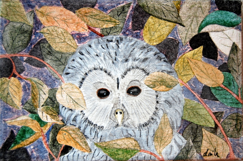
The blue background color and most of the greens have faded. The owl looks good, except for the beek, which has lost the color. But, have a look at the eyes, the darkest colors used, still looks the same.
Now, I can't tell if the gesso or the fabric or both have influenced the Twinks. The fabric may have had a coating, so it's hard to be sure. Lots of heating up and cooling down has happened over time, that might matter as well. One should perhaps try it using good quality paper and then see over time. Another thing is that most people would NOT hang their art in direct sunshine, whether it's front or back.
Below is a photo of the two together for a better comparison. 

Please do not understand this as the final conclusion to light fastness of the Twinks, 

 but it did happen with this painting.


 I would love to hear it if any of you have your own experiences or thoughts on this topic, please leave a comment so that we all can get the information. Thank you.

Linking to Paint Party Friday  

Happy PPF everyone! 

Sunday, November 8, 2015

It's about time, isn't it?

Oh my, I had no plans to stop blogging, it just happened.


My mother has returned to Spain, so things are well with her. I've spent the summer playing with the two bonus grand children. We've had lots of fun and now we know each other very well. Last month, or so, I have returned to sewing. I had totally forgotten how fun it is to sew my own clothes, but today I finally sat down with my paints again.

I've used Twinks, regular watercolors for the background and pen and ink.

 Best to start with something easy, it's far too long since I touched my brushes and I really felt how rusty I've become. A freehanded mandala isn't the hardest thing to start with so the choice was easy.


 In fact this one is made on the last page in my very first Zeta journal. I started using this journal for my watercolor pencil class, and now, ending it with Twinks.


Stillman & Birn Zeta series, I just love working on this substrate. It's very smooth and stands alot of water and mixed media techniques.
These small mandalas are very pleasing to make, and I get to practice many different texture techniques along with them so I was thinking of dedicating a new journal to small mandalas only. The smaller journal, 5 1/2 x 8 1/2 inches, is very suitable for such subjects. Can't wait to get started.

Wednesday, July 15, 2015

SOC 5 week 6, last week for this time.

Last week of Summer of Color.

This weeks colors is: orange + orange + blue.
I went with the first idea that came to mind this week. It's just a doodle, but very fun to do. Below you'll see part of my piece, how it looked when the paint was down.


It really doesn't look like anything special, but this is when the fun part begins. Now I'm going to add alot of lines to give the shapes a bit more life. The tip of my black pen was a bit ruined so my lines are kind of rough in this piece, but I don't think it will matter much for the end result. Below is how it looked with the line work done. I forgot to photograph before I added the finishing layer, so I had to cover it up a bit, sorry for that.


Now it's time to lift it up from the paper by shading the shapes. It always surprises me to see what a difference shading makes. It's so fun to see the 3D effect and how the shapes rises from the background.


SOC 5 is over for now, sad but that's the way it is. All we can do is to wait till next year. It has been fun, even though I didn't quite like how the colors were combined this year. But, as I always say to myself, a challenge is a challenge.

Thanks alot to Kristin and to all the lovely people who have been taking part of it all, not least thanks for all your inspiring and lovely comments, it's a thrill to read them all.

Wednesday, July 8, 2015

SOC 5 week 5

Green - green - pink.


I knew excactly what to do this week when I saw the colors. But, as often before, it turned our much harder than first thought. Actually I left my idea and did something else instead.


It's pretty hard to paint a rose in one pink color only, and many times during the painting process I wanted to add yellow/orange to it. But, I didn't because a challenge is a challenge and I wanted to stay true to it.


The pink I used was Pink Azalea, Twinkling H20 and the greens are Cobalt green and Forest green, both in regular watercolors. White and black pens and Paynes grey for shading.
On a certain stage I only wanted to leave it and start something new, but I kept going and the result is the best I could do with three colors only.


I am surprised on how hard it feels to use this limited palette, and I'm sure it would be much easier to use a triad instead of two colors in the same color group. Triads are very fun to play with, and they give lots and lots of  possibilities.
I hope everyone had fun playing this week.

Monday, July 6, 2015

A bit too ambitious,

I said I was going to start sketching city scapes,

well more correctly I meant street views. So, I had this photo from a street I wanted to try. Very soon I saw it was too ambitious to start with.

The buildings had too many details, and to finish it the buildings would be too small to add all. I just did the first two, and put down some colors to it. Even though I didn't mix any colors, it's quite amazing to see the changes in a sketch when it's colored.

I started over and sketched our garden house, more familiar and easier done. I did this same sketch a year ago, and it's so much better now. I still need to practice trees and hedges, but it's kind of a  promising result.


Uplifted by this result I sketched our house as well. It's wonky and many details not quite correctly done, but I painted it and it's good enough for a start. As you probably know, we have several buildings on our property, so I have many opportunities to practice.


When I look at this sketch now, I see I've told just half the story. We do have neighbours, and in a new one I'll add more of the surroundings too.

One of the warm and sunny days we just had, I actually sat outside and sketched the entrance in more detail. Wonky as well, but I can feel this will become something I'll love to do.


I'm not showing these to tell you all how good they are, it's more to show that it's possible even if the result isn't all that good. One has to start one place, and this is where I start. Now I can only hope to improve, perhaps in a year I will have a better grip on it.
That's all for now, have a fab week all.

Friday, July 3, 2015

Finally summer

It's warm, warm, warm and I love it!

Class work has eased up and I have been practicing some more loose style this past week. It is incredible how much more relaxing it is to not think of an end result. Erika asked me, in a comment, last week, if I felt it hard to let go of control, and no, not at all but I still need control from time to time. But to loose up is a good way and one do not have to choose between them. Each technique is better for certain things.


My banana is very loose and I was experimenting with the black ink. I really think the ink can become part of the artwork itself, not only an addition to it.

Otherwise I have been thinking of sketching cityscapes, and for that I'll need to add people to make it more realistic. So, the other day I sat down playing with some left over colors in my palette and made people. Color and a brush and just do, it was fun and two three of them are really good. I think I'll make it a habit to use left over colors to make people, one day I might have it in my hand to make them. In a painting I'll have to use different colors on their clothing, if they're not just black "shadows" to fill in the picture.


I also did some sheep experimenting. Sheeps are a big issue where I live and also they have an easy shape to draw/paint. Once you find the typical lines for a sheep, they're very easy to do. I did these in less than 30 minutes, but I had done some studies earlier on.


In class I've done the red peppers or capsicums as I understand they're called as well. Not as loose here, but I got caught up in thinking perfection. 


Mid spread in my booklet, and this time I used a few words from a Norwegian song to follow the painting. I'm happy with the result, but also learned (Tracey told me) some important stuff. That pomegranate was beyond the stage of being rescued, so I turned it into a laughing face instead.

Linking to Paint Party Friday.
And, once again I will thank you, lovely fellow bloggers, for your inspiring and kind comments. They're much appreciated.

Wednesday, July 1, 2015

SOC 5 week 4

Red + red + metallic

YES, I love reds so this wil be fun. This were my first reaction to this weeks colors, but then..........
A rose and no greens?......... no. What excactly can I do with two reds and a metallic, and I do allow myself to use white and black/grey in addition. It was hard to come up with something to do, but finally I had an idea coming my way.

Some glas balls would work. I prepared a "canvas", one hard cover from an old book covered with old book pages. My intention was to make two balls in an orangeish red and two in a more pinkish red and the last one in gold. It turned out being a mess and I added red to the gold one too. Not good, so I started a new one.


This time I went for some real marbles, all red but still marbles. And why I didn't think of doing one marbel in gold I can't understand now. It was probably because of the first try, I guess.

While in the phone with a friend I added gold to the background, and regretted it the minute it was done. Wash over with clean water and pick up as much as possible. It is not the result I had hoped for, but I'm not going to do it all over once more.


I will do a piece with marbles again, but then I'll use colors of my own choice. It was much fun painting them, but the background should have been left white. Lesson learned. And as said, why didn't I add another marble and used gold for that?
Except this weeks colors, I've used white and paynes gray.

Good luck everyone! Linking to SOC 5

Friday, June 26, 2015

Time is coming too fast, I think.

This last week in class,

Tracey suggested to me to just have a play with my colors without even thinking of the end result. I did that and had lots of fun and at the same time I felt much more free in the process. Somewhere along the play, I figured out I would do three of the same and make them different, and that's a great way to learn. I'm glad I did this and I'll try to remember doing it on a more regular basics. The dream would be to feel this free and loose in all my work.


Even though this is a painting class, I've been concentrating on the line work. I so much admire Tracey's artwork, and especially her line work. That's her signature, so to speak.  So, during the class I have made lines, over and over again, on old paintings, on new ones and used the dip pen on it's own to draw and make lines. I want to have my own lines, not just outlining or copying someone else. Below is a small collection of what I have been doing, and kept. Much, much, much more is already in the bin.


One of the things I did is this pear. I did exaggerate (on purpose) the lines in every way, and I love the result. If I try to imagine some of the lines not there, I don't think it would be this good. This pear is filled with energy, and it was the first of three editions.


I love the shape of my pear, and wanted to paint one to use in class, and the one below is what I did. This one is a bit more realistic in shape and colors, but still I love the first one the most.


The last one I did was for the SOC challenge, one of three pieces this week. I used pastel sticks to make this and I was pretty rough laying the colors down. I wanted it to look very expressive and loose in style. I really like this one as well. Isn't is fun to see how different they all can be with different ways of making them, I hope I'll never stop wondering, and asking what if..........


This post has to come to an end, and I'll end it by showing you the next spread in my booklet. My paintings and drawings side by side with the little verses/poems.


I'll link this post to Paint Party Friday, and if you are not familiar to that party I recommend you to visit and take part.
I wish you all the most beautiful weekend in every sense of the word.

Wednesday, June 24, 2015

SOC 5 week 3

Purple + purple + yellow..............

I always find it hard to use these colors, the purples are not my favorites. But, I decided to give them a real try this year, and so far I've made three different pieces.
The first one I did the day after drawing and painting lots of veggies, so it felt natural to do a turnip.


I couldn't resist adding a bit of green to it, and therefore I felt like cheating. I had to make another one.
The next one is a pair of cups. It's so hard to use these colors, that the only thing I did was to make some splashes of color. I'm not particularly happy with this one, and there's nothing more to add.


The next one I'm really happy with. I used pastels and was pertty rough with the colors. I used a dip pen and ink to add some black lines and that's it. Funny pear, but I like it and it's much prettier in person.


Later on today, I will make one more try, using this weeks colors and then it's enough I think.

I will link this post to SOC 5.

Saturday, June 20, 2015

How was your week?

I've had a fantastic inspiring week,

and also got lots of painting time.
I'm still, after several years of painting, always surprised on how much a small collection of colors can do. It's a true joy to sit down each morning with fresh, clean water and my watercolors, and just create whatever I want to. I know for sure that my lifestyle is just a dream to many people, but real for me and I truly appreciate it.

SOC 5 week 2 is pink + pink + orange. Lovely combo and some of my favorites. It was very tempting to make another flower, but I chose to experiment a bit instead. In fact, this is an idea I've had for some time and now got to test it a bit. My colors this time is: Twinks, Jasmin and pink garnet the orange one is "flat" watercolor. Black and white in addition this week.


In class I had a go on an old can I have, and I have to say I'm very pleased with the result. Someone asked me if I were going to frame some of my work, and I said no because I have so many from earlier that should have been framed, but this one does need a frame.


I have chosen to make a booklet containing some of my paintings in class, together with poems/ verses. I made the front cover the other day, and am happy with that. It has a good feel to it and as it's growing, it becomes more and more a part of me.

First spread in my booklet looks like this. An English verse I stumbled upon some years ago, and that flew right into my heart. I so much admire people that live their lifes in a practical manner. Lol.

Right side contains a Norwegian poem about the wasp.
Now, it seems I have gotten into some computer trouble, and can't access the classroom. So I'm not sure I'll be back in there, but the problem is worked on. In the meantime I'm painting on my own, and today it's time to paint a red pepper.

Beautiful people, thanks alot for all your lovely and inspiring comments, I really appreciate you for taking the time.

Linking to Paint Party Friday and SOC 5.

Friday, June 12, 2015

Yet another busy week

I've been working hard in class

and now I feel I'm slowly taking on board all  the new stuff. I really enjoy to test all the new in private also, so my entry for the first week in SOC 5 is a tiny piece done in Neocolors 2. Colors used are: phthalocyanine blue, dark ultramarine and light olive. Beside that I've also used black and white ink.


At a certain stage I thought I'd have to throw it in the bin, but I've learnt to follow my instincts and at the end I really love how it came out.

Otherwise in class I've made veggies, some flowers and other things as well. It really takes some time to clean the "top drawer" to make room for new learning.


I absolutely feel more confident now, and starting to get the grip of my pen and ink. The corn cobs below were fun doing, but the first one (right side) ended up not being as good as planned and I made the other one as well. They both have character and when I see them together, I think of a couple dancing a fiery tango.


 My dragon fruit, pink, pink, pink! Some weeks ago I saw a dragon fruit for the first time in my life, I didn't know what it was other than it was heavenly beautiful to look at. I bought it promptly and photographed it so that I had references to paint from.


Isn't it quite an ironi that I've been trying to paint droplets for ever so long, but never could make them good. In my fruit I tried to paint a dip, suggesting I couldn't wait to eat some, and all I can see is a pile or a droplet.

Thank you for stopping by, and all your lovely comments.

Linking to Paint Party Friday and SOC 5.

Have a good weekend all!

Friday, June 5, 2015

What a week this has been.

You know the feeling

when you're about to learn something new and can't get the grip of it. Frustration. I started my class and did follow the lessons, but I didn't really understand what I was doing. Some exersices was so unfamiliar to me, I nearly went mad trying to do them. I did some of my usual stuff, and they're more than good enough, but hey, that wasn't what I have come to do more of.


So, almost like an accident the one below emerged. I had lost every bit of expectations and just messed up some colors, I didn't even like the colors I used untill I started thinking of sea shells. The result is very good, I think, and has the look I were searching for. But it just happened, I still didn't know how and why.


So, I had to bite the bullet and ask Tracey Fletcher King for advise, and I got the best explanations one could ever dream of. Spot on and clearly delivered. It was all about the line work. With my spirit flying high, I went back to my desk and for the first time, tried out what I now had learnt. And this time I was consious about what I were doing. What a difference it makes to fully understand a technique. 


I did it over and over again, and all I need now is to practice, practice and practice even more. I will be searching for the lines I love the most and also which lines to which subjects.


It's such a relief coming out of the darkness and know excactly what to do to achieve the results I'm looking for. Tracey is a very good teacher, so if you ever get a chance, I highly recommend one of her classes.

Linking to Paint party Friday, happy painting everyone.

Friday, May 29, 2015

Waiting for something good

I've been kind of restless this last week,

in waiting for the class to begin and the summer to arrive. While waiting I have nearly finished my bug, just the background remaining. I'll show it again when completely done.

I did order some new tube watercolors in waiting for class, and yesterday they arrived in the mail. Colors are my main source for inspiration, when I see colors I always want to sit down to create something. BUT, remembering their names is quite another task. When I'm painting, I always know what color to choose by instinct, warm or cold, bright or toned down.
To help learning the names, I've made a "map" of my watercolors. Perhaps I now will learn the name of the red-ish blue and the one which is more green-ish. And which is which of all the reds.


 Our appletrees are in full bloom right now, and since we've only had cold weather the colors are spectacular this year. I picked in some small branches and had to paint them, they are such beautiful flowers.


Have a look at the colors, so intence pink.


Over a long periode of time I have wanted to paint a blue painting, and had a go some days ago. It's not the worst painting I did, but it didn't turn out as I had hoped for. I consider this one as a test for a larger piece in the future.


Three more sleeps and the class is on, as Tracey Fletcher King would say. Yay, bring it on!

Thanks alot for all your lovely comments last week, I loved reading them, all of them. Linking to Paint Party Friday again this week, have a good week everyone"