Saturday, June 30, 2012

Another try.


I had to try it once more.

I still had so much eggshells that I had to try some more. Could this be done if I planned a specific motif? I tried to make a fish, yes it's possible but not easy to form the shells. They break very easily. Because of that I won't make the large piece that I was thinking to. Instead I tried to make a flower and that was much easier.


You see in the photo below that I randomly squeezed the shell- pieces down to the paper.  The only thing planned here is the stem and the leaves. Both pieces are better in person. The shiny stuff is not easy to photograph.


Just a tiny update on this last day of June.


Take care!

Friday, June 29, 2012

I wonder.......


Yesterday I was making a cake to our sons Birthday and I started wondering, isn't there any way of using the eggshells?
 Now, I think they can be used in artwork.

 I peeled off the thin layer inside the shells while they were still  wet. If one can't do it right away it probably would work to put them into water untill one has time. That was pretty easy. Then I " washed " them and let them dry completely before use.


I coloured them using my twinks and let them dry well. On my paper I painted a background with WS crayons. On top of the background I used Matte medium to glue the shells down. When all was dry I added Clear Tar Gel on top of the shells and the result is the one abowe. This was just a try to see if the shells could be used. Next time I will plan a bit in beforehand.

Have a wonderful weekend!

Thursday, June 28, 2012

Using old letters # 2.


This is my second one in this " series". 


I'm very pleased with this result. It's not as easy as it might seem to paint one colour from light to dark. I worked quite a lot to gain this result. When one choose to add diagonal lines into a work they have to be accurate, I think. For me that was a challenge too. It's easy enough to make a line, but even the smallest "bumps" became extremely visible here.  As it is now I think it's ok.
Originally I made a shadow from the mail person, but something was wrong so I undid it. All that's left is a weak colourchange on the wall to give a hint of a shadow. I'm still not sure I won't try once more, the shadow added some more interest to the whole painting.

This one is called " Sunday Letter ".  I really like the spacious feeling here. I tend to use too many details so this was a try not to. This painting measures 50 x 60 cms. I've used acrylics and old originale letters on canvas.


That's what I've been up to lately. I have at least one more to paint, but that'll have to wait a bit. We have a Birthday to celebrate here and my mother is coming home tomorrow.

Have a creative day everyone!

Sunday, June 24, 2012

No doubt this is my boy!


 I'm so happy I could dance.


 When I look at it now, of course I see details that could've been better, but I found it was time to stop. I'm happy that it came out so well as it is now. Not even in my wildest dreams did I think I could do this. Yes I can paint and yes I can paint a face but to get it to look like someone I knew, who on earth would've thought that? At least not me.
Well, I could, and I'm as happy as I can be! Handyman is making me the frame, it's a simple one because I want it to be. First time my son saw my work he said, and this is his excact words : which onion is that? I saw his glittering eyes, he recogniced himself emediately. And YES he wants to have it.
June 28th is his Birthday and then he'll have it.


Right now I'm deep into a new project. Below is my first painting as it is now. I'm not sure whether it's finished. I can feel at least two more coming, they're part of my "using old letters " project. The one below is called : Naked Thruth.
 I've been in this flow for a long while now and I just love it. It feels like I could work on forever.


What's on your workdesk right now?
Take care everyone!


Thursday, June 21, 2012

I'm on the track.

I'm moving forward, but slow.


It's amazing how many feelings that comes alive when I'm doing this painting. How much I would love to hug this little boy just once more. But, that's 25 years too late.
He so came alive when I added his toy named Kose as in cozy. He had two ways of carrying him, as you see in my painting or holding him in the downpointing arm. That's why that arm is slightly longer/thinner than the other one.

Now I can feel I know the face, with his full cheeks and the clare strenght between his nose and overlip. I'm so excited to see if I can get his eyes right but frightend as well. If I can't do them it won't be right. The form is correct now with one eye a bit different from the other. Of course I believe I can make them right, but I'm not sure.


Yesterday was such a day when nothing would work, so I put it aside and did other stuff. Today I'm going to find the right redness to his cheeks. Alot of work remains on Kose too, I have to make him fluffier. I really enjoy doing this, especially when I feel I get it right.

As it is right now, this really IS my boy, and it is me doing it! Unbelievable.

Have a beautiful day.

Wednesday, June 20, 2012

Small scale suits me especially good.


During the weekend I enjoyed making my very first ATCs.

 How cool to make them!!  I really enjoy to make the most out of  little. In fact, I made inchies first. My two first cards have them as decoration. Inchies was fun too. I sure will make more of them both.
 I started to think if it couldt be possible to fill a canvas with inchies, and could each inchie be part of a larger image?  I can feel the itching in my fingers already. I have to try that.

When it comes to painting on canvas,  I'm not sure whether that is my medium. I don't feel I have enough control when I try to. I will finish what I have started though and perhaps I'll like it more as I practice. The one of my son is going well so far. It's always difficult to make the "perfect" skintone so that's what I'm working on right now.


Inchies and ATCs was fun though so that is a great way to differ a bit.

Have I ever told you that I wrote a letter a day for nearly a year, to a prisoner, 16 years ago? Well, I've kept copys of what I wrote and also kept the ones I got in return. Now I have decided it's time to do something about them. So, I will use them as backgrounds for some of my work. The text on my ATCs are some small lines from the letters. And below you can see a face I made (10 minutes) on top of such a background. It's challenging to make a face within that timelimit. But, as you probably know by now, I like to challenge myself.


Just some small things I do in between all the canvas stuff.

Have a terrific day !


Tuesday, June 19, 2012

My largest challenge, ever!


 A short update


While I was preparing the gift to my son yesterday, it stroke me why not paint him.
And I started this painting today. If I can do this, I can do anything. I'm not at all certain I can do it but, I want to try.
I'm using a photo to paint from. He is two years old and the photographer gave him an empty lipstick to hold in his hands. I prefer to let him hold his all time favorite toy, a turquoise elephant.


Wish me luck, and have a nice day you too!

Monday, June 18, 2012

Have you ever seen this before?


In between all the painting I'm doing, I needed to do something fairly easy and relaxing stuff.  I've been thinking of doing this for a long time but did never do anything about it. Now was the right time so I jumped to it.
Actually I once saw this done 30 years ago. A friend of mine was going to be married and her twin brother made the couple a piece like this of the two of them. Since then I have been thinking of trying it myself.

I think this idea can be used in several different ways, I am going to make our son a special gift for his birthday towards the end of the month. I'll use a photo of him from his babydays and one from the kindergarden.  That could be nice I think.
Anyone who remember these two faces I made a year ago? They will be my testing objects.


What I did was this : I cut the two faces into equal pieces, width 4 cms. and hight 24 cms. and glued them onto a sturdy sheet. It's important to notice that their eyes are at the same hight. Glue down and let dry. Fold your work like an accordion ( I did this with my papercutter, after I had changed the cutting tool with one that doesn't cut and before I glued the pieces onto the sheet.) and fasten to a new sturdy sheet. Be accurate,  Each of my pieces are 4 cms wide, so I felt it suited to glue every downpointing foldtip 6 cms apart.  Many of you don't operate using cms. Use your own unit of measurement but make a test (copy your photos) first to be sure of getting a good result. Was this understandable? Feel free to ask.

Below you see how it should look, seeing it from the top.


  If you see the result right in front, it looks like this.


If we move to the left, this is what happens.


 Go to the right and the other face will show. Yay, it works....how cool is that! It's so fun to pass it and see it change from one image to another. This would be the perfect artpiece in a long hallway.


This was something I made just to test the idea. Imagine you knew the persons, and if they both were looking a bit towards the middle of the work. That would give the impression that they were looking at each other. I think perhaps black and white photos would be even better if people are the motives.
What do you think? Siblings, Me and Handyman, Sweethearts, your pets or perhaps a couple of artpieces that would mix perfectly together.
 The opportuneties are endless, and I would love to see what you create if you try it.

It's difficult to photograph a piece like this one. You know, there's only one angle that shows the perfect image and you'll need a bit space to move on, to see it. To see it in person is quite another thing. It was fun to make it and it's easy if one are accurate from the start.

There you are, go ahead and try making your own piece.

Friday, June 15, 2012

Blooming right now.

Isn't this a beautiful time of year?

For us, living up north, it is anyway.


I took my camera for a walk in my garden and these photos shows a bit of what's blooming right now.

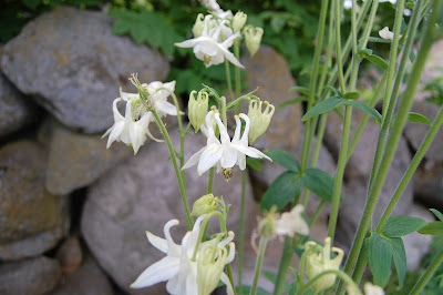
This columbine is an old type, it's easy to spot if you know what they've lost during development. These old types do have the characteristic swans. Can you see how each flower is formed by a ring of swans? Newer types have lost that clear image of swans.
They are beautiful but they do spread alot. I used to have them both blue and pink as well.


We have four of these Rose Havthorn trees. Right now they are blooming and they look beautiful. One has to be close to see the beautiful "roses" though. I also love their foliage with that soft green colour.


The Queens in my garden. The Peonys are my all time favorites. Of all my peonys these are the ones that start blooming first and as you see they're almost done. This year I'm going to give these ones a better place to grow because I don't think they have the best conditions where they are now.


This one is about to start blooming. Look at that colour! I have three more to come, one of them is "Bowl of beauty" a real eyecatcher which will have more flowers, than ever before, this year. I'll be back with a photo of that too.


The Irises are beautiful too. This one is a Siberian type and I love its colours and lines.


I have to smile each time I see this one. I bought it because of its beautiful pale salmon colour. I even asked specific about the colour. Well, it turned out blue in my garden!


Just a little tour in my garden. I hope it inspires you like it does me.
Over the weekend I'll share with you a new exciting project I have been testing. In between all the painting that is.

Have a great weekend everyone.

Thursday, June 14, 2012

A sweet and clever girl.


 We had much fun last weekend.


You know I bought some crayons for Sandra and last weekend I gave them to her as a present. I did wrap it in meters and meters of paper just to trick her a bit. The photos says it all.


Excitement


HEYYY...another one.


Lailaaaa.....


Ohhhhhhh..............


She loved having her own crayons and tested them rather quickly.
Below you see what Sandra painted in acrylics this weekend. We agreed on making her poster in August. As you see she was inspired by what I did but this is her own though.


She doesn't feel any kind of fear in front of her canvases. It's amazing to see how she just starts to paint. I really hope for her that this approach will last forever. Now that she has been allowed to use acrylics she feels that is the real thing. She loves it.

Thank you for for stopping by, tomorrow I'll show you some lovelies from my garden.
Untill then.

Wednesday, June 13, 2012

Time to break the fear.


This week is for painting on real canvases.


I have never been able to understand it when people talked about their fear of a white canvas. I even hold it for credible that I might have made the pf f f f ft sound and called it silly.
My imagination is well developed but I could not imagine fear connected to a white canvas. That was for chickens only.
I assure you, all of this was before I met a white canvas myself. I'm a chicken and I promise to never make that pfffft sound again, ever!!

With all that said, I have made a decision to break that fear. The next days I will paint on canvas untill Mister Fear has left this home. It feels a bit crowded with him staying here.

My first canvas measures 50 x 60 cms. I start by filling it with paint in different colours. During the process I start wondering if I could make a waterfall. I give it a try, and yes, I could. Perhaps not the most credible waterfall you've seen but it is a waterfall. I continue to make different shapes as they appears in my head and after some time I called it done.

This is how it looked....


and it changed to this....


and this...

and ended up like this.


Now I'll put it aside for awhile. I'm thinking of doing some more to the front space but don't know what. It isn't for anything so I might paint another one on top.
But, it's not bad at all even though it's not excactly a Michelangelo. Best of all, I forgot to think about the fear. Perhaps he's already gone. My next  try will show.

Life is good to me, I hope it's good to you too!

Tuesday, June 12, 2012

Did you try mixing?


Here is what I mixed.

Both samples shows the result as they came out without any adjustment.

0030-B30G
This one is a beautiful turquoise. My mix is a bit too dark but, if I was going to use it I would have added a bit more white. One thing I always do, is to mix in the black colour last thing I do. Many times I feel no need for black at all. Do you like my Clementine? Unfortunately my imagination is far  better than my drawing skills.

 No black 3 boats of colour 7 boats of white. -  70% blue 30% green


2040-R50B

This one is too dark too.  It seems I have to be more careful with the black colour. What amazes me is how much less paint I use by doing it this way. I can easily mix a small amount and come pretty close to what I'm aiming for.

 2 boats of black 4 boats of colour 4 boats of white - 50% red 50% blue.


What I would suggest to you is, notice which colours you don't mix easily. Visit your local paint dealer and pick the colour samples you need. That way you can build your own colour map.
If your local dealer uses a different system, get a person to explain it to you.

It seems I have a problem with the "Click to enlarge " function. I hope to fix it but it might take some time.
Best wishes for the day!

Monday, June 11, 2012

A very helpful colour system.


Are you familiar to the NCS  - Natural Colour System


I came into contact with this system when I worked within the interior business. I was asked to go to Oslo for a weekend to learn from, at that time, the very best man in business. His name is/was Bjørn Reinhartsen and he was the leading man in the colour department at Jotun. He was so engaged in colours and beyond inspiring to work with. Each day he came to class with his shirt pocket filled with colour samples. New ones each day.

One morning he seemed more than usual engaged. He started class by telling us about one of Norways well known paintings, he snapped the colour samples out of his pocket and said : And these are the colours used. We all recognized the colours, as any grown American probably would recognize the colours in the painting : Pilgrims Going To Church by George Henry Boughton.
 He had spent the evening in the art museum and picked the accurate colours. I will never forget that man, he made such a great impact on each one of us. What he didn't know about colours wasn't worth knowing. I had the pleasure to learn from him even one more time. Because of him I became even more interested in colours than I was before.


He thought us that the only way to excactly describe a colour is to use the NCS codes. (Or similar system codes of course) To simply say Navy blue is far from excact even though the other part understand in which direction the colour is. Well, enough of that.

What I will describe for you now is pretty much the same all over the world I think, so it might be useful in one way or other.
 First of all you need to know the the basic colours used, Yellow (Y), Red (R), Blue (B), Green (G), Black and White as in the well known colourwheel.

I find my colour samples very useful when I am about to mix a colour that most often is hard to gain. That way I don't waste as much paint and I don't need to accept a brownish hue if I aimed for, lets say, a greyish one.

It is said that the codes don't tell anything about how to mix the colours but for me they do.
A typical NCS - code looks like this : 1050-Y90R This describes the excact colour as we see it and, for me, how it's mixed.
10 means 10% blackness (black)
50 means 50 % colour ( Y90R)
Y90R is the shade, Yellow with 90% Red
 Without mentioning it directly, this means that the yellow quantity is, in this case, 10%

Within the system this colour is called yellow, that is just a system issue. All of us will call it red.
If we subtract 10% + 50% (the two sets of numbers first in the code) from 100% we will also see that this colour contains 40% whiteness. (white) To gain 100% in the first part of the code, we will always have to add a quantity of white. The two sets of numbers decides how much white we need.

Y90R is the first thing I look for, Yellow mixed with 90% red. That gives a warm red. Ready mixed it looks like the lower one in the photo. A warm and beautiful pink.


 Another example is this code : 1080-Y90R  As you see the shade is the same. The only differens is the quantity of colour and a reduse of whiteness.
Just remember to subtract the two sets of numbers from 100 to find the whiteness.

As I have told you before my enthusiasm for maths is low. My imagination though is very good, so what I do is this.
 I imagine a perfect, colourless clementine. It has 10 boats (= 100%) ( in Norwegian we call them boats) each boat represent 10%. Isn't that a great way to imagine the quantities. Well, at least it works for me. Two boats of black, one boat of white and seven boats of colour. It makes sense to me.

Awhile back I was going to mix some sand colour (beach sand) I had no idea where to start except white, but by using the code it's much easier. Code for my beach sand is : 1005-Y20R That is : one boat of black, half a boat of colour and eight and a half boats of white. See, beach sand as quick as never before.
Of course one can never do this excact, by hand, but it is much easier and a smarter way of doing it. At least for me it is, since I'm not trained in mixing colours. And, I use the codes only on the more difficult colours to mix. It also means that I can get that specific colour as many times as I want to.

Hellooooo, are you still there with me??

As if this wasn't challenging enough, give this one a try.
Yesterday I promised you a challenge and I would  love it if you'll join me.

0030-B30G
2040-R50B

Try to figure out what kind of colours these two are. Try to mix them if you want or describe them in terms of flowers, fruits or whatever you imagine. I will be back tomorrow with samples of my own mixing and photos from the fan.
If anyone will leave a comment telling me how you think they looks like I would love to hear from you!

   LETS HAVE SOME FUN !!!


Friday, June 8, 2012

Not Listening.


I had a bit time after all so I'll share my thoughts with you today.

Here I have assembled the whole series to make it possible to see them all in one place. I'm sorry for not beeing tecknical skilled. The photos could have been much better if I knew how to do it, but I'm " allergic" to all kinds of reading tecknical stuff. SORRY!! ( Do you think I have a job to do here? )

************************************************************************

When I chose the blue/ bluegreen colors  it  was because I love them. The coolness and distance making effect they have suited well for my project.  The fact that these colors also have a calming effect gave me a challenge though. To fall apart isn't excactly a calming process, I think, and that's why I chose to add all the running paint as symbols of unrest. Each piece has, more or less, a  troubleing mind and needed something to underline that.

All the names of the pieces do describe what I actually did to create them. The doublemeaning is the most interesting part, I think, it can be alot more than just the obvious. It gives people the opportunety to  listen to what that specific piece are telling them. Each piece can live well on their own, together they tell a story. A story of  beeing unbalanced and all the way to falling apart.

I have to tell you a story about my paternal Granny. She was in every way a heavy weighter. She had a neighbour friend that certainly was a great person too, but thin as a line. In one occation they both were photographed together and Granny showed me that photo while saying : Too much and too little are equal bad. Be sure to balance your life. And she was laughing while saying it, she was a humorous person which I still admire. I often think of this and how wise it really is. Be balanced, good advice!

The fact that I didn't add the ears was planned even though it suits me well to avoid drawing them. As said I didn't know this whole thing would end up as a series. The missing ears is one of the reasons I can call my series: Not Listening. I have experienced  a few times that people won't listen while they're having a troubled mind, my main reason for not adding the ears.

Not Listening


 Unbalanced


 Building Up                                                                                             Disturbed


Loose Face


Falling Apart

Did this make any sense to you?
 All in all I've had a fantastic journey. It always feels good when things are working like I want them to. Now I have to get myself a good printing deal. I won't let the colors fade. That copy paper isn't worth much so they'll have to be properly printed.

Thank you so much for your encouraging words during this journey, it ment alot to me!

Please, drop in on Monday and I will give you a small colour challenge. Want to play with me?
Untill then.

Thursday, June 7, 2012

A good idea.


I want to share a good idea with you.

Back in the end of the 90's I bought a piece of art that a friend has made. She did use roof stones as her canvases. Those stones have an uneven surface and she incorporated that as part of her art. I thought the idea of using  those stones were great. Now I realize, that in a few years I might have hundreds of canvases. We will need to change our stones sometime in the future and then............

A minor drawback is that the stones are pretty heavy, but they have these marks in each side so it is possible to hang them.


My last two pieces are done. I'm working on one more but it seems impossible to do what I had planned. I will keep trying though.

The one below is called " ONE Side Open." This one is slightly different from the others, and so is the last one.


The last one is called " Building up "  What I didn't PLAN with this series was  the clear story that slowly came into beeing. Of course I knew there would be some bonds between them since I worked within the same theme. I now realize that I started with the end of a story and worked my way back to the beginning.

Otherwise all the rest was planned, that is, there is a meaning behind each element. Both the obvious ones and the more not that obvious ones.


In my next post I'll tell you how I think about this series. Anyone who has been wondering about the missing ears?

This weekend Sandra is coming and tomorrow I'll have to prepare for that. We will plan her poster and perhaps start making it. So my next post might not show up untill Monday.

Have a wild weekend everyone!!

Wednesday, June 6, 2012

Loose Face


Todays result was hard to gain.

 I made three trys before I was satisfied. This piece is called  Loose Face. I sort of like the double meaning, can make people think and have their own opinion.
I wanted to add the running paint at the same time as I wanted to control the running area and I didn't want the the running startpoint to be too obvius. It worked well I think.

Have you ever experienced to see someone in the phase of loosing face? Just imagine how it looks, you know that "glassy " expression, they see but they don't see. They pull themselves together and makes a distance to all the rest.

I tried to express this by using some glossy things at the falling parts. That idea came to me right before I was going to bed last night. A bonus effect is that the running paint doesn't fasten to the falling parts either. That is a plus, because I was a bit worried if the small parts would kind of disappear in all that other mess. This way they stay almost clean. The photo below is very close to how it looks in person. It was a bit challenging to photograph this piece because of the glossyness.


I used a flashlight in the one below, the shiny parts overtakes it all.


 In the photographing process I was a bit creative and I got some amazing results. Look at the photo below, isn't that amazing? It's not white paint, it's the flashlight tucked in with papertowels. The rest of the photo didn't get any light on, just a tiny bit on the shiny parts.

I think  Loose Face will be interesting to hang on the wall, imagine candlelight.


I have two or three more coming. Not sure I can do them but I'll try.

Good luck on whatever you are doing!

Tuesday, June 5, 2012

Two more done.


I truly wish to stay in this mood forever!

I have been playing, trying, doing over again and and even repeat it. I think it's the first time I've had such a RICH idea. How do you normally work?
It seems I'm working in series. It's easier to try out different things that way. Thanks alot for leaving a comment on my former post. I was so surprised when Janet said I was always thinking of new ways of doing things. Why surprised ? Because I always feel I'm doing the same things over and over and over again. That's why I always look for new ways or new ideas, trying to avoid beeing boring. Thanks alot Janet, for beeing an eyeopener.
 Well, nobody has ever told me that I was boring, it's probably me that's beeing bored.


I'll show you two different pieces today. The one below is the one I made as my second.  I was thinking of calling it Disruption, but I'll have to check if that term normally are used describing a human state of mind.
There is something about this piece ( I can't nail it ) that make me wrinkle my nose. It improved alot when I added all the strait lines. Mostly it's the colours I think, but there are something else itching my brains too


Because of my wrinkled nose I made a second try. This time I'm pleased, even though I speed painted the background and didn't believe in it at all. See the differens in the colours? It's more airy this one, the summer feel. Perhaps that's what my nose like. :)  I think this one is my favourite so far, but I'm working on another one that looks exciting.


Now I'll continue working, it's a blessing with all my new colours.

Have a beautiful day everyone!

Monday, June 4, 2012

Falling apart.


After finishing my third doll painting last evening

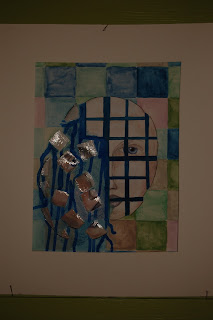
 I wondered what to create coming week. I sat down to read some posts in google reader and Quinn Creative's was one of them. Her post is called: It's Not Creative if it's Disruptive. And BOY did she light a spark in me. Blogland is a fantastic place to find inspiration. She didn't write about falling apart but, on it's way from her, through my brains and onto the paper, this is what happened.

I sat down at my desk promptly and made a very quick face. This simple face will be the main element in all my work this week. When this was painted, it was time to find the bed.


I rose early this morning with my head filled with even more ideas. First thing was to make some copys of the face and I downsized them a bit.


With my new colours I made a background using some summerly ( is that a word ?) shades.  Cutting the face and placing it before the final touches.


VOILA....... Falling Apart is done.

I had to "frame" it to calm it down a bit. I'm very pleased with the result of this day. Tomorrow I will make another one.


My selfportrait promise is broken, it's so hard to draw my own face. Another time perhaps. But this week I'll have sooooo much fun. Now I'm off to say thank you to Quinn.

Have a creative week you too!!