Showing posts with label watercolor pencils. Show all posts

Friday, February 26, 2016

Friday again and a giveaway.

I did not notice where this past week went.

Making art and looking after the youngest grandchild took my week.

Have you ever thought of how inspiring the world wide art community is? The internet has indeed made a huge change in our lives. I still find it incredible how I can write something on my computer and within a few minutes have answers from the other side of the globe. How many people we meet online and connect with, it's nothing but a miracle.


I so appreciate you all, the followers of this blog, you who regularly visit the blog and not least you who take the time to leave a comment. It's very nice to get some feedback and read your point of view. But, mostly I appreciate you for all your sharing as well. To see what you do and read about your process, learn from tips and tricks you share are all things to learn from and  every time I read a blog post I get inspired. I am truly thankful for all your sharing, and what a variety there is to choose from.  These are thoughts that have been on my mind lately, and a need to give something back has occurred. And that brings us to the giveaway part.

Click to enlarge 
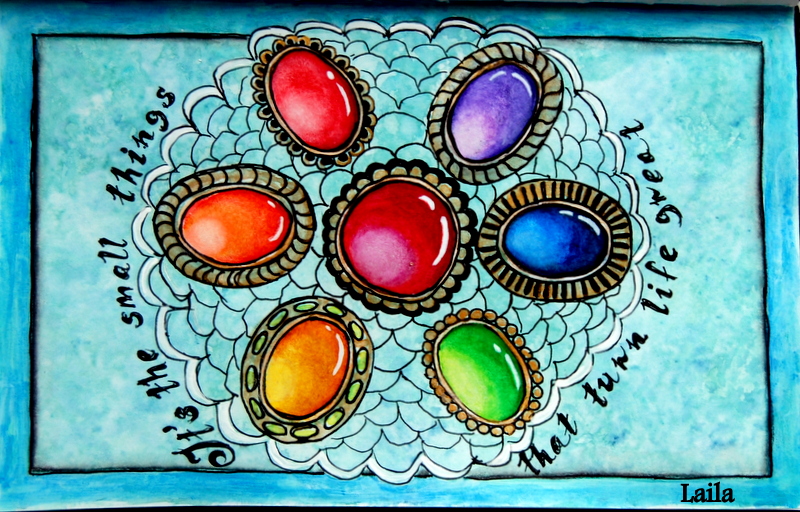
 I have made these tiny pieces of art (10 by 10 cm only)  all displayed in the photo above. My hope is to give away three of them to three different persons as a tiny thank you for all the inspiration you provide me. I hope you have room for one more piece of art.
They are numbered 1 - 10 just to make it easy for you. All I need you to do, is to name which pieces are your first, second and third choice in a comment to this post. I'll draw the winners Thursday March 3rd. and publish the result next Friday, March 4th, here on my blog.
Anonymous comments will not participate.

Now, they're all mixed media techniques. The colors used are watercolors in some form, and they have all been coated with matte medium on top. The 10 x 10 cm piece of paper has been mounted onto a 10 x10 cm canvas.The edges are painted black/dark grey.

I hope many of you will find something you like and participate, and I'm very excited to see which pieces are your favorites.

Linking to Paint Party Friday, enjoy everyone!

Friday, January 22, 2016

Who are we trying to fool?


I have been thinking lately

what kind of signals we pass on to the world. How fantastic our lives are, what great successes we have, how up to date everything around us are, not to speak of our amazing homes, cars and the newest cell phones....... and on and on and on.


It's no wonder the youths get problems if no one tell them what life really is. That problems are a part of life and we have to deal with them, find reasonable solutions, give and take and put into action what we have agreed on. Act friendly and be polite.


I have a good life and it's the small things that make me happy. Everyday moments that I appreciate, and when looking in the back mirror, many of those moments have turned into small gems worth a lot. It can be as simple as the sun shining on some grass, or shining on a frozen landscape where trees and grass are white and glittery. Or it can be when I rise in the morning and handyman has lit the stove and it's already warm for me. Small things but making my life good, and by keeping my pleasures small I'm guaranteed plenty of them.


I'm taking part in a weekly art challenge called Color Me Positive, and the prompt for this last week was : Make today so awesome that yesterday will be jealous. I really don't like any form of jealousy and that was what made me think of all this. Let me add, it's a fun challenge and most times there are more than one option in prompts.


 My art here is what I made for this weeks prompt, and as you see I underlined the small things in life.

How would you describe your life?


I'm linking this to Paint Party Friday, so happy PPF everyone.

Friday, May 29, 2015

Waiting for something good

I've been kind of restless this last week,

in waiting for the class to begin and the summer to arrive. While waiting I have nearly finished my bug, just the background remaining. I'll show it again when completely done.

I did order some new tube watercolors in waiting for class, and yesterday they arrived in the mail. Colors are my main source for inspiration, when I see colors I always want to sit down to create something. BUT, remembering their names is quite another task. When I'm painting, I always know what color to choose by instinct, warm or cold, bright or toned down.
To help learning the names, I've made a "map" of my watercolors. Perhaps I now will learn the name of the red-ish blue and the one which is more green-ish. And which is which of all the reds.


 Our appletrees are in full bloom right now, and since we've only had cold weather the colors are spectacular this year. I picked in some small branches and had to paint them, they are such beautiful flowers.


Have a look at the colors, so intence pink.


Over a long periode of time I have wanted to paint a blue painting, and had a go some days ago. It's not the worst painting I did, but it didn't turn out as I had hoped for. I consider this one as a test for a larger piece in the future.


Three more sleeps and the class is on, as Tracey Fletcher King would say. Yay, bring it on!

Thanks alot for all your lovely comments last week, I loved reading them, all of them. Linking to Paint Party Friday again this week, have a good week everyone"

Friday, May 22, 2015

Lots of painting this week

In between very hard work on my bug,

I've done some more warmups for my class in June, and it's really fun to try new things to paint. I'm absolutely out of my comfortsone by doing this, and the results are showing that. The bug is very time consuming and I need breaks from it. Both for the intencity while working and also to keep a fresh eye on it.


The paint bottle below is one sitting in my studio and have some text as well. The letters are very hard to get right, but it isn't too bad. My whole painting is a bit wonky.......... oh well.........


At this stage my painting looks a bit disastrous, but I know it will come together nicely if I'm capable of doing the right things. That's why I need fresh eyes from time to time.


Next one is an old sketch I did for a larger project, and this one had never been painted. It was my very first try on stacked cups. As you'll see my sketch was done in a hurry, but it learnt me what I needed to know for my project. Now, it came in handy for my warmups.


At least it starts to come together, but the big shell needs more work. In person it is a bit darker but still needs to be darkened some more. I so much enjoy working on this one. When the bug is done, I''ll make the background as well.

I also want to give credit to Jaroslav Maly, the photographer. Most kindly he gave me permission to use his photos as inspiration for painting, and as painter one is always in need of new subjects to paint. The photo I work from can be seen here.


Still my text isn't good, but better than the first one. It was tricky to paint the walnuts, I've done much better walnuts than this. The black text says walnut kernels. I would never have thought it was so fun to paint this kind of stuff, but it actualy is. Worth trying. And now, I'm shopping food for the looks of it, just mentioning..............


Let me end by saying thank you all for your lovely comments last week, it really made me happy.
I'll link this post to Paint Party Friday, and I look forward to visit all the creative people out there.

Enjoy the weekend!

Thursday, May 14, 2015

So much fun ahead.

I'm finally painting again.

It's been so long wothout any painting, that I had to make some small easy ones to start with. The first one isn't anything but a try of layering. I always think it's so pretty when I see paintings with lots of layerings in them, so this was my first try in a long time. It's done on a textured paper meant for acrylics, I used Twinks and watercolor pencils to make mine.


Next one is done in my Zeta A4 sketchbook. I've made this rose once before, but in a much larger scale. Twinks once again and the purpose was to get the paint flow and me to relax. I think I did both things well. I hope you'll get the feeling of depth in this one, that's why I share the angled photos.


One more to go before I got to a bit more serious stuff. This one is a prismatic painting, but all of a sudden I were carried away and added shading and.......... well, I'm pleased after all. This one is also in my Zeta sketchbook and Twinks.


Below is the reason I sat down with my colors again. I so much wanted to paint a giant bug. This is a work in progress, and it will take me quite some time to finish, but I love doing it and will enjoy every minute of it. I've just started his head, so it's the initial layers only, visible here. Paper in use is Fabriano Artistico extra white hot pressed 140 lbs. Very nice to work on, and for this one I use my watercolor pencils.


As I wrote in my last post, June is almost here and along with that Summer of Colors 5 start again. I'm so looking forward to that, and now I've bought me a class over at Community Trive, thought by Tracey Fletcher King, called Deliscious Painting. I so much want to be able to loosen up a bit, and I think Tracey is the best one to learn me that.
Just as a warm up, I sat down and made this last piece. I had to see if I could do something similar to her videos on the topic. I'm pleased with it and am so excited.


It seems June will be packed with fun for me, and I can hardly wait.

I'll link this post to PPF for a change. Happy PPF everyone.

Friday, November 14, 2014

Edith in progress

It's a long time since I've done any faces.


You know Johannes Vermeers painting, The girl with the pearl earring. That's what I've used as inspiration for my painting. And, when I had done her eyes yesterday, I thought she looked like Edith in the series, Downton Abby. Can you see it?

I'm pleased on how she is turning out, the only thing that might be a problem is her nose. I'll just have to work on it. I'm using watercolor pencils for this one, and I'm very happy for having control of the painting process. Watercolors are much harder to control, and I always feel acrylics won't cooperate as well with me.


I'm not sure I will do more about her, I don't need a copy of Vermeers painting. I might do another one and change her a bit. I'm planning on doing a piece with a girl and some birds.


Coming weekend I'll probably spend time on my computer, trying to figure out how to use photoshop. I've been talking of that programme for so long, that handyman bought it for me yesterday. Now I'll have to do the tedious job of learning how to. Wish me luck.

Tuesday, November 11, 2014

I need your point of view

I've had some busy days doing other stuff than making art.

Hopefully things will settle down so I can play with my colors again. I've looked into the possibillities of making prints of my art, but have a hard time to decide what to do.


What I ask myself is this:

Do I really want to reduce the value of my originals by selling it as prints?
I know I'm not excactly a Picasso, but still.

Should prints be made by professionals or would it be good enough to make them at home?
This is a question of quality and price. I would love to let a future customer know he/she has bought quality above low price only. I appreciate quality in all aspects of life, and I'm sure there is a
REASON we have professionals.

How many prints from one original?
If I end up making prints, I'm sure I'll set some limitations. Would 10 pieces be fine as a standard?

Should the originals be sold as well?
Yes, I see no point in collecting my own work, except perhaps some rare ones that's hard to live without.


If you read this post, please let me know your thoughts about this issue. How do you do it, and what's your experience? Oh my, there's so many questions to be answered, and I don't have them all.

I've been urged to do commissions and put my art into the world, but I'm not quite sure I have the confidence needed.

Art in thos post made using watercolor pencils, before and after background.

Monday, November 3, 2014

Tea Party

The final project in class was to make a stack of tea cups.


I saw it as an opportunity to throw an imaginary tea party, and wanted to add some  extra to my piece. A tea party for the entire class, and our teacher as the guest of honor, you know, that's how I like to think and imagine when I'm making a piece of art.

Our teacher, Dion Dior, is Australian and the guest of honor, so I had to come up with something as a tribute to her. In real life, that wouldn't be a problem, but in a "small" painting it wasn't quite so easy.
I came to think of another fantastic Australian woman, designer and artist Loani Prior, who designs the most spectacular tea cosies one can ever imagine.


I contacted Loani Prior and asked permission to use one of her designe in my piece of art, and as the sweet person she is, she immediately said yes to my request.

When I first saw this tea cosy, I was convinced it was inspired by the Sydney Opera House so that's what I've made it look like. Loani, on the other hand, has called this one for Wood Fungus. Loani has written several books which can be bought here. Go have a look.

The Sydney Opera House is situated close to the water, so the body of my tea cosy is meant to represent water, and on top the famous sails. It was, in fact, the Danish architect, Jørn Utzon, that drew this building.


Personally I don't drink much tea, coffee is what I prefer. But I know lots of people have tea as their prefered drink. For some it's even a must like coffee is to me.
That was a sidetrack, my finished painting above, I'm happy with the result, even though I do see things that could be improved. This was a very fun project.

Enjoy your tea/coffee!

Friday, October 24, 2014

How do you approach a new painting?

How much work do you put into the preparations for a painting?


I used to rush on and paint right away, no planning no nothing just do it. That has changed. If I am to paint poppies, as for this case, I like to research the subject using the internet or perhaps books I might have on the topic. Normally I sit down with some sketch paper, trying to fetch the" ultimate" movements or shape of my chosen subject.


It's almost like I try to get the feel of it in my hand. I often paint those sketches just to see how they will work, and very often this play leads to new and exciting ideas.


Yes, it was poppies this time, but a rose found it's way too. I've been working on roses as well lately, so it didn't surprise me. The photos I have shown you above, are just a tiny bit of what I did to find the right feeling of the flower.
I also worked quite alot to find a composition I liked, and then the painting began. The result of my efforts is shown in next photo.


Later on, I have been filling in the white contours around my subjects, it just didn't feel right to leave it as you see it here. I'm very pleased with my results of this one. The darker areas on the right half has an undertone of violet, which dosen't show in this photo. The upper left light area also has a light turquoise shining through.
Painting is becoming more and more fun the deeper one gets into it, I think.
Faber Castell, Albrecht Durer watercolor pencils is used and it's done on a Fabriano cold pressed 140 lbs paper.
Have a nice weekend, and thanks for stopping by!

Saturday, October 18, 2014

I'm trying to expand.

How much do you think of composing your art pieces?


We're probably all aware of The golden ratio, or the rule of thirds. but do we pay attention to it? I have decide to research it and learn more about the use of it. It's quite interesting when one first start to look into the subject.
Resently I came across a theory based on the golden ratio, and I found it so interesting that I tried it on a piece I made. Photo below.


The theory is based upon how we, by nature, look at things. At least for those of us which are reading from left to right.  By composing your art following this theory, you should be able to keep the viewer's interest to stay with your piece.


The blue lines shows the golden ratio, and to achieve a good and balanced piece of art, one do place the main motif at one of the crossing points, A,B,C,D. This is the rule, whether your sheet is small or large.

The upper right square is made into a smaller 9 square piece and then again an even smaller one lower left. The dark red line indicates the viewers way into your piece of art. Starting top left, and it will be up to us as artists to create interest along the line. Your most valued point of nterest, should be within the square in which the dark line ends.

Now, how did I use this in my piece?

From the start I thought of making a curtain from top left, stright down, hanging with folds, but found that it would disturb too much. Instead I made the wall quite dark, and added some darker spots a bit closer to the table, leading the viewer to the walnuts. Even though I planned this for quite some time, I missed out on a couple of things. Learning, always learning.

The walnuts should have been further back on the table, I would love them to break the table line. Now, I put in much effort to make the walnuts as realistic as possible, hoping for the viewer to want to see more. And, lets say the viewer wanted to see more, he sees some pears, but what's catching his eyes is the red rosehips, smooth and shiny. (Contrast to the walnuts) The rosehips are made realistic as well, but it doesn't show well in my photo. After looking at the rosehips and bird, the wiever sees this stright line upwards. The surface of the crown/cage is rust, non reflective, again a contrast to the rosehips. He reaches the top, and find the reflective ball. This is where I missed out again, the crown should have been stretched an inch upwards. Looking at the smooth shiny ball, the viewer notice the leaves, and I had pure luck with my branch. I didn't plan that to happen, but the branch leads down to the walnuts again. I also made quite some work with my branch, to keep the interest up.

If the viewer is still there, he probably steps back to have a look at what this is all about. That's when he notice my main subject, the pears. The soft and silky surface, in contrast to everything else. I deliberately avoided pencil strokes or splatters on my pears, to create a huge contrast. The tablecloth and wall is also made to highlight the softness of my pears.

There is very few strong white highlights in this piece, and that is excactly what I planned. The front rosehip, the bird (eye and beek) and the juvel of the crown, are the only places you'll find the highlights. Why, you may ask. Because I wanted it to have a soft, calm and cosy atmosphere.

Do you think my plan works?

Saturday, October 11, 2014

Have you heard of Giovanna Garzoni?

She was an Italian painter who lived from 1600 to 1670.


I'm taking Dion Dior's class  "Watercolor pencils", and let me say that this is a very different way of working. But, as the fabulous teacher Dion is, I actually am learning to use these great tools.


Beside the "homework" I like to practice on my own, and thats where Giovanna enters the scene. She was a female painter which were rare back then, and she's looked upon as a real arrow tip when speaking of still life painting. It was portraits that ruled the ground, and there she was painting still lifes, not for bragging, as for the portraits but for pure decoration. Don't we just love that? Female artist going her very own way.


I have a book in which a photo of her painting Open pomegranate is shown, and I thought. let me have a try. Convinced that I really couldn't do it, but to my surprise I actually did. This study thought me alot of things, and will forever remain in my sketchbook. If the paper quality were better, I would have made the background as well.

If you don't know anything about Giovanna, have a look at this tiny film I found on you-tube, showing alot of her beautiful art.

As you understand, I'm quite busy at the moment, but will be back soon.

Enjoy your weekend.