Showing posts with label Paintings. Show all posts

Friday, March 23, 2018

Not much painting

I'm still having the flu

and didn't do much this past week. Just some small quick paintings to get to mess with paint.


A tulip always makes me smile this time of year, and this one did too. It always gets me in a better mood to play with colors.


This last one was very quickly done, and I love the result. It seems I can't get enough of rough handmade papers. Have a nice week everyone.
 I'm linking to Paint Party Friday.

Friday, March 16, 2018

Preparations

Once in a while I like to paint a larger piece

and in those cases I find it very useful to research my subject.


I always try to find the right lines or the most typical movement of my subject. As you see this time it's all about magpies. I really love this bird, and I have 4 or 5 of them in my garden on a daily basis. They're much fun to watch but they can be rather mean to one another.

At this point I have no clear idea of how I want my new piece to be, the composition, I'm just playing with lines and movements until I get a feel of it all. It's also very useful to try different colors so that I can find what I'm searching. How do you approach a new larger painting?


I'm always surprised of the white color, nearly every time it's in use it's every other color than white that bring the eye to see white. Think of a white flower, how is it we paint  the white??
Oh, how I love working with colors, always so much to learn and to understand. My Neocolors have become my favorites, for the longest time I've preferred the twinks but now it's changed.


How do you like the greedy one? I so fell for this one, photo from Steve Lyddon, PMP, it just HAS to be the main focus in my piece.
To my great joy I discovered that a pair of magpies are nesting in one of our apple trees, I hope they will stay there and hopefully get fledglings. That would be great fun.

I have to thank you all for all your well wishes last week, I'm still coughing like crazy. This flue is said to last at least 5 weeks, so well, one week down.

Linking to PPF. Have a nice week, friends!

Sunday, April 9, 2017

One year without posting.

Where did the time fly?


I've had a busy year and my life is good. My studio has been closed all winter, I've been playing with yarn and hook/needles, but now I couldn't resist any more. Studio is open and I deep into the paint. It feels so good and as always when I start the ideas keep coming faster than I can grab them.

From time to time I have several magpies in the garden and the other day we had lovely sunny weather and the magpies really showed them self off.


At first glance one can easily think they're just black and white, but they actually have the most beautiful colors hidden in the feathers. The magpies was what got me started, and since then I have not stopped.


Twinks, neocolors and watercolor pencils. Black and white ink.

I hope you have a gorgeous sunday.

Friday, January 8, 2016

WIP, has to come to an end.

This piece has had a long life just put away.

I have decided to finish such old ones this year, and this is the first one. I have to say, I've learnt a lot since the beginning of this, and now I do see many things not as good as I first thought.

I have been reading much about composition since then, and I wish I'd done it a bit different.
Here is where it all started, 

I need to change almost everything in it, it all seem so flat. But building depth is possible, and I'll try to get it done. Below you see the one face done. I like it much better. This piece measures 70 by 70 cm, so there's a lot of work to do.

Now, this face need to be sculptured, can you see how flat it is?

Here they are, both faces done. To do this work, I'm using my inktense watercolor pencils. Working on top of fabric and wetting it, it's very risky so I have to be careful.

Below is a photo of it all. I've just started working on some of the houses. I am excited to see what can be done and if it's worth the effort. As for the composition, it's too symmetric and too centered. I do believe though, that by adding more contrasts it may look different.


I'll link this to Paint Party Friday, so happy PPF everyone.

Oh, and it's my 58 birthday today so I'm going to have a good day and finally start my new year as well.

Wednesday, January 6, 2016

Fantasy birds, a successful artswap.

I was asked to do an art swap, which I love,

and agreed to that. My online friend and I came to terms on size and type, and I actually got so inspired that I felt it just flew out of me.
My friend asked for a specific motif, fantasy birds in some sort of woodland, based on something I had shown earlier. My substrate measures 28 by 35 cm, so it's quite large.

I did make a sketch to position my subjects and plan the background. The birds were a bit troublesome until I changed their eyes. Then it went smooth.
Below is my piece with some initial washes of watercolor.


It is made in mixed media, watercolors, Twinks, crayons/ watercolor pencils and ink. At this stage I always feel that the lights are being turned on. It's incredible to see the change the minute the twinks comes to use.


I felt a bit uncertain to which colors to choose for the birds, and actually they started out as pink ones. But, it was wrong and I felt it all the way to my fingertips. 

I turned them into purples instead and that made a huge difference. Below is the finished piece, and I assure you, it's much prettier in person. The birds might seem a bit sad, but they're discussing where to live now that their site in the rainforest is about to be cut down.


Teresa was kind enough to send me a photo of the framed piece, and I loved it the minute I saw it. And now I'm sure the birds have found a good site as well.
And, this is it. I so much love the way Teresa has chosen to frame it, the black color really makes the birds stand out. Thanks for allowing me to use your photo, Teresa. Isn't it gorgeous?


 And, here is what came in the mail for me.  Teresa calls these trees Fortune Trees, and mine is titled Green Meadow Tree and I love it. I do need to find the right spot for it to hang though. It's a 30 by 30 cm canvas, even the hanging gear is mounted at the back. It's even more beautiful in person, and it makes me happy just to look at it.


 My old house do not have many white walls, so I need to try the painting in different places but I know I'll find the right spot for it. Thank you once again Teresa for this successful swap.

Monday, January 4, 2016

Monday makings

Happy New Year everyone,

I hope you've had a wonderful season.

2016 is the year I will try to post a new little mandala, prismatic painting or other small stuff made in my Zeta journal, each Monday. At first I was thinking of doing mandalas only in that journal, on page two I made a prismatic painting. Lol.
I'm not very good at limiting myself to one thing only, that's why I'm going to call these posts Monday makings. Several of these are made in 2015, but not shown earlier. I have to have some in store so that I know I have something to share if the inspiration should leave for better weather.

My first is a mandala made using colors I do not choose very often. The background colors were chosen as complementary to the ones used in my subject, but all of a sudden I had changed some of the main colors. It ended up like a mess only. I signed it and thought, oh well one can't win them all.


But, next day I couldn't live with giving up so I sat down again, continued playing and the result is much better, in my opinion at least. 

So many times I forget to trust the process of creating, wait, put it aside and then see what happens. Most often I instantly know what to do after a break like that. What about you?

I've also decided to use this new year to finish up some old works. I've already started on a large piece that have been bothering me for a long time.

Friday, November 13, 2015

Lightfastness or just being silly......

An accidental study in light fastness.


Using and loving the Twinkling H2O's I remember a fellow student asking our teacher whether or not the twinks were light fast. She couldn't give an answer to that because she had not been testing it.
I didn't test it in purpose either, when my painting were done I sat it in a south faced window, meaning lots of strong light and sun. My painting has been sitting there for a year and a half, back of painting facing the window. You might remember this painting from April 2014.


The canvas, on which this is painted, I made myself. It's a hard book cover, gessoed and sanded. New thin layer of gesso and a very thin cotton fabric on top. When dry I carefully sanded the fabric to get rid of any fibers peeking up, and then I did my painting. Now, a year and a half later, this is how it looks.


The blue background color and most of the greens have faded. The owl looks good, except for the beek, which has lost the color. But, have a look at the eyes, the darkest colors used, still looks the same.
Now, I can't tell if the gesso or the fabric or both have influenced the Twinks. The fabric may have had a coating, so it's hard to be sure. Lots of heating up and cooling down has happened over time, that might matter as well. One should perhaps try it using good quality paper and then see over time. Another thing is that most people would NOT hang their art in direct sunshine, whether it's front or back.
Below is a photo of the two together for a better comparison. 

Please do not understand this as the final conclusion to light fastness of the Twinks, 

 but it did happen with this painting.


 I would love to hear it if any of you have your own experiences or thoughts on this topic, please leave a comment so that we all can get the information. Thank you.

Linking to Paint Party Friday  

Happy PPF everyone! 

Friday, October 24, 2014

How do you approach a new painting?

How much work do you put into the preparations for a painting?


I used to rush on and paint right away, no planning no nothing just do it. That has changed. If I am to paint poppies, as for this case, I like to research the subject using the internet or perhaps books I might have on the topic. Normally I sit down with some sketch paper, trying to fetch the" ultimate" movements or shape of my chosen subject.


It's almost like I try to get the feel of it in my hand. I often paint those sketches just to see how they will work, and very often this play leads to new and exciting ideas.


Yes, it was poppies this time, but a rose found it's way too. I've been working on roses as well lately, so it didn't surprise me. The photos I have shown you above, are just a tiny bit of what I did to find the right feeling of the flower.
I also worked quite alot to find a composition I liked, and then the painting began. The result of my efforts is shown in next photo.


Later on, I have been filling in the white contours around my subjects, it just didn't feel right to leave it as you see it here. I'm very pleased with my results of this one. The darker areas on the right half has an undertone of violet, which dosen't show in this photo. The upper left light area also has a light turquoise shining through.
Painting is becoming more and more fun the deeper one gets into it, I think.
Faber Castell, Albrecht Durer watercolor pencils is used and it's done on a Fabriano cold pressed 140 lbs paper.
Have a nice weekend, and thanks for stopping by!

Saturday, October 18, 2014

I'm trying to expand.

How much do you think of composing your art pieces?


We're probably all aware of The golden ratio, or the rule of thirds. but do we pay attention to it? I have decide to research it and learn more about the use of it. It's quite interesting when one first start to look into the subject.
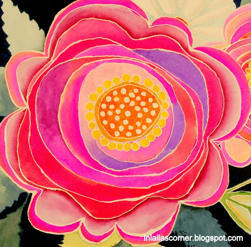
Resently I came across a theory based on the golden ratio, and I found it so interesting that I tried it on a piece I made. Photo below.


The theory is based upon how we, by nature, look at things. At least for those of us which are reading from left to right.  By composing your art following this theory, you should be able to keep the viewer's interest to stay with your piece.


The blue lines shows the golden ratio, and to achieve a good and balanced piece of art, one do place the main motif at one of the crossing points, A,B,C,D. This is the rule, whether your sheet is small or large.

The upper right square is made into a smaller 9 square piece and then again an even smaller one lower left. The dark red line indicates the viewers way into your piece of art. Starting top left, and it will be up to us as artists to create interest along the line. Your most valued point of nterest, should be within the square in which the dark line ends.

Now, how did I use this in my piece?

From the start I thought of making a curtain from top left, stright down, hanging with folds, but found that it would disturb too much. Instead I made the wall quite dark, and added some darker spots a bit closer to the table, leading the viewer to the walnuts. Even though I planned this for quite some time, I missed out on a couple of things. Learning, always learning.

The walnuts should have been further back on the table, I would love them to break the table line. Now, I put in much effort to make the walnuts as realistic as possible, hoping for the viewer to want to see more. And, lets say the viewer wanted to see more, he sees some pears, but what's catching his eyes is the red rosehips, smooth and shiny. (Contrast to the walnuts) The rosehips are made realistic as well, but it doesn't show well in my photo. After looking at the rosehips and bird, the wiever sees this stright line upwards. The surface of the crown/cage is rust, non reflective, again a contrast to the rosehips. He reaches the top, and find the reflective ball. This is where I missed out again, the crown should have been stretched an inch upwards. Looking at the smooth shiny ball, the viewer notice the leaves, and I had pure luck with my branch. I didn't plan that to happen, but the branch leads down to the walnuts again. I also made quite some work with my branch, to keep the interest up.

If the viewer is still there, he probably steps back to have a look at what this is all about. That's when he notice my main subject, the pears. The soft and silky surface, in contrast to everything else. I deliberately avoided pencil strokes or splatters on my pears, to create a huge contrast. The tablecloth and wall is also made to highlight the softness of my pears.

There is very few strong white highlights in this piece, and that is excactly what I planned. The front rosehip, the bird (eye and beek) and the juvel of the crown, are the only places you'll find the highlights. Why, you may ask. Because I wanted it to have a soft, calm and cosy atmosphere.

Do you think my plan works?

Thursday, September 25, 2014

Hello friends,have you missed me?

Let me start by saying, I'm fine and well. We've had the most beautiful summer I can ever remember, and I have spent my days outside and also spent alot of time with my mom.

In addition to being my mom, she's the most humorous person I know and we've laughed alot together this summer. Now she's returned to Mallorca, Spain, where she lives most parts of the year. The photos below shows what we saw a day out by the sea.


Late summer I start preparing for winter by knitting socks and I have also been making some cute little hats and "shoes" meant for newborns. So, I have been doing something.


That's some of the things I've been doing, and now I'm back in the saddle playing with colors and papers again.


I hope to be back on my blog on a regular basis again, so I'll see you soon.

Tuesday, July 8, 2014

SOC 4 week 5

This weeks colors gave me some real challenges.

When do I use bright red, bright blue and a bit light blue together? I felt it was impossible to make anything with these colors. They are beautiful, but not together, alone. If I could add some yellow and orange, I would have had lots and lots of ideas.

I simply had to chew it for a couple of days before a thought came to mind. I were thinking of my maternal grandma, she died when I was 6, 50 years ago. I still remember her, how very kind she was and all the things she did. One thing I always were excited of, was when she were making jam and lemonade from the berries she had in her garden.


I stood beside her (4-5 years old), ready to have a taste as soon as a batch were finished. Oh how I loved that. And then I ran out to play. I don't know if lemonade is the right word for what she made, but it was a consentrate of the berry juice. When we drank it, we added water to it.


Do you remember the rubber caps? She always used them, hot bottles filled with hot lemonade and then the rubber caps.

The jam were stored slightly different. Hot jar filled with hot jam, and then she added a thick layer of wax before the cute little fabric hats. I remember her kitchen counter filled with those cute jars. She made jam from many different berries, but my favorite always were strawberry.


She labeled all the jars and bottles, name of berries used and year. I can still remember how I longed to become a grown up and make all this good stuff and decorate it myself. Well, I've done it a few times. The kitchen is not my place, I do make the food we need to eat, but that's about all.

Thanks for visiting, I hope you've enjoyed my little story.

Thursday, May 29, 2014

The process

I had this wonderful day yesterday.

I was experimenting and ended up creating a beautiful piece of art. It all started out with a thought, what if.....
and I had to try it.


I drew my subject, and masked out all the lines. For me it was important to keep the lines slim and as even as possible. Next time I might vary the lines as I saw that can be beautiful too. I picked my colors, Twinkling H20's and some flat Senellier watercolors. I had nothing planned, so I just followed my intuition while doing the background.

Masked and ready for paint

Let me tell you something, almost always when I'm creating something (when painting) I end up rescuing instead of creating. I always feel I'm about to ruin my piece and have to take serious steps to save it. Anyone else that feel the same way?
With this specific piece it was the background that came out so very wrong. I was thinking to use negative painting as my technique for the background, but decided not to use my pencil to outline the leaves as I went on. That was a mistake. Flat watercolors and freehanding the leaves, I'm just not that good yet.

Disaster

As you see above, most of the leaves looks weird and I were close to give it all up. But in a strange way while painting the flowers, my brain worked on its own and came up with some ideas. With acrylics, I reworked the background. I kept the leaves I liked and painted over the weird ones.


It's always so exciting to remove the mask to see how and if it becomes as I had envisioned, and this became even better. The upper leaves is greener than my photo shows, I don't know why they turned out so pale.
I simply love my end result, and this piece has to be framed.
Thanks for stopping by, I hope you enjoyed your visit.

Tuesday, April 29, 2014

Art journaling

Today my fried and I had our first art journaling day together.

We had fun and she made her first page. Not at all happy with the result, which I very well can relate to, but the most important thing is that she's started. I had to get started yesterday just to warm up before we met, and I did a page which I thought of as finished when I left it.


But, of course, it wasn't finished. A lot more work to do here. This page was one I had left a long time ago, and finally wanted to do something about. I didn't have any plans except getting my fingers messed up with paint, and I sure did. Acrylic paint, some neocolors 2 and markers are what I used to make this one.


Yesterday I also had the great pleasure to order some new Twinks. 5x The Whole Enchilada and some for me as well. I'm so happy for that, 5 new people that will start painting with the Twinks, and I get to increase my collection as well. Not bad at all. I also finally ordered quite a few Zeta journals and some more watercolor paper. Boy do I have alot to wait for in the mail. It feels just like winning the lottery.


My journal spread is done, and I'm happy with the result. The colors are a bit more balanced in person, my photo shows it too blue.
We've had pure summer here for some days, and our appletrees are just about to blossom. I'm so looking forward to that, they're so beautiful when it happens.

Thanks for popping in, I hope you've enjoyed your visit.

Friday, April 18, 2014

Daily routines messed up.

It has been an odd week.

Handyman free from work and my days have not been as usual. Isn't it strange how one can't get the routine to work properly with another person around. It's not that I don't like to have him home, I just notice how things change.


Just a little sketch I did, the text says : They told me it's summer, but I don't know, it's cold and no nests here.
I have come to use my sketchbook alot more than I thought I would. I often use it for testing out things that I'm going to make larger pieces of. Next photo shows such a test.


I had made a piece with birds, but didn't like it much because the birds, kind of, just sat there. No life in the piece so to speak. Therefore I decide to make another one where the birds were "alive"  The finished piece below is called : The Angry The Brave and The Curious one. This is a much better one, and one can almost hear the noice from the birds.


I have been doing quite much arty stuff this week, even with handyman around. Much testing, failure, but new ways of using my result and so on. I'll have to show you some other time, today I finish off with a journal page done in acrylics and twinks.  It was quite a job to paint the fence, but I had to because of some very dark photos in the book.


Finally, let me tell you that I was one of the lucky winners of a free spot in Dion Dior's Watercolor Pencil class. Yayyyyy!! Starts in September, I think. She has lowered the price of this class till the end of May, so why don't you consider a spot for yourselves. Dion is a very skilled artist AND teacher. I so much look forward to this.

Thanks for stopping by, and happy Friday everyone!

I'll link this post to Friday Sketching and Paint Party Friday

Tuesday, April 15, 2014

From nothing to wall.

I have been working on black paper

and combinations with black paper lately. There is a lot to discover and I find it very interesting. I don't know why I have not thought of using my twinks on a real canvas, but I did that some days ago. The canvas was an old one that has been painted on several times, acrylic painting. So, I gessoed it black and wondered if that would give any results with the twinks.


As you see above, I drew a pretty simple subject since this was meant to be an experiment. I drew a sketch on paper and transfered it to my canvas using white pan pastels on the back of my sketch.

All the texture in the canvas were there from earlier use and I thought it may add to my painting. What I discovered was that my paint withdraw from certain areas, and instead of reworking I just let it be. Below is the final result.


I did use my beloved neocolors 2 on top of the twinks in the background. It can be too much shimmer, so I like to reduce it by using some matte mediums. That may be neocolors, colored pencils, regular watercolors or pan pastels. It worked out well, and the best part was that it didn't curl up as my black paper. All I did was to varnish it in the end.


Since I had a nail in my diningroom wall, I tried to hang it to look at it for awhile and it's not bad at all.
The cast shadow even made it look like the vase is sitting at a tiny table. Pure luck.