Wednesday, August 31, 2011

New York time again.

Three new images from old NY.

Hello everyone.

Here are the next three images from old times.
The first one shows U.S. Custom house.
This looks like an impressive building, but newer photos shows that today it's not that big after all. But, it is a very nice building. The sculptures in front represent the four continents: Asia, America, Europe and Africa and they helps make the huge impression. I'm especially attracted to the flying flags, they always make me feel good. It's almost like they're expressing : Here we are and we're proud of it.
You can read more about this building over here.

The printed text says: "The U.S. Custom House occupies an entire block at the foot of Broadway facing Bowling Green between Whitehall and State Streets to Bridge Street. It is a magnificent carved granite structure, the finest of its kind in the world, erected between 1901-1907 at a cost of $7,200,000. The site was formerly occupied by Fort Amsterdam."


The next image shows: Hudson Terminal and Tubes.

Have a look at the boats, steamboats! It's interesting looking at old images, they can tell so much about the time back then.
The printed text says:" The Hudson Terminal Building on Church Street,between Cortland and Fulton Streets are twin structures, and together from the largest office building in the world. The weight is estimated at 200,000 tons, resting on a cofferdam 400x178 feet, 75 to 98 feet deep. It is 22 stories 375 feet high and has office room for 20,000 people. Twin tubes enter the basement from Jersey City."

It occures to me that the infrastructure was so well planned back then. While we still was using horses if we had one. :-)


The last image today shows: The Post Office.

Wow, if only the those offices could look the same today.
The printed text says:" The General Post Office, located at the intersection of Broadway and Park Row is one of the finest granite buildings in the world. It has 47 branches 251 sub-stations and there are 38 other post Offices with 76 branches with a total of 410 sub-stations for the entire city. The General Post Office also contains the offices of the U.S. District and Circuit Courts."

It seems to be a lot of the best/largest/finest in the world. Probably used to build the nations fellowship. Just as many of our painters back then made all those romantic landscape paintings.


That was all for today, I hope you have enjoyed it.
Take care and thanks for visiting.

Tuesday, August 30, 2011

I have enjoyed my day journaling.


Today I have used some of my new art supplies.

Good evening.

Today have been a relaxing day. I have spent my day making patterns. It's kind of meditation repeting the same movements over and over again.

The photo below shows my new items. Most of the Indian ink pens I already had, just some of them are new. These are my favs. They have a tip like a brush and they work on EVERY surface. If you ever get the opportunety to buy one I highly recommend you to try them. Especially the grey shades are useful, but I love all of them.

For a long time now I have wanted to have a stamp with a feather on it and yesterday I found it....ON SALE!! And I even found the Micronpens. It must have been my lucky day yesterday. :-))


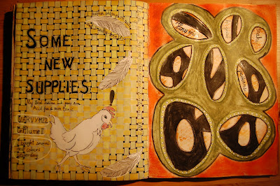
This spread shows what I've been doing today. The left page shows a pattern I've wanted to learn for a long time, and finally I took the time to learn it. After this page I'won't forget it again. You can also see my new feather on this page together with a hen I had as a leftover from another spread I did earlier.
This hen looks like she is a bit irritated and the feathers make me think that there has been a fight of some kind.

The pattern on the right page is inspired from a fabric I have. Actually I tried to copy that fabric on my copymachine but it wouldn't work. The fabric is very light weight. But, I did copy several other fabrics today as a preparation for tomorrow when my friend is comeing and we are going to play together. I'm really looking forward to that. I will try to remember to photograph as we are playing.


This last pattern gave me some new ideas to try. Isn't it fun how new ideas comes to you while doing other things? I love that symbiosis.

I wish you all the best.

Monday, August 29, 2011

I'm done with faces.


I did an experiment.

Hello.

I didn't feel for doing faces on a daily bases any more, so I tried to copy one of my paintings. Downsized it just to see if it would work. And it did.
This journalpage was part of my experiment. Boy, have I missed working in my journal.

When I and my friend painted together the other day I got so inspired by her. I've really done some sheets that looks exactly like how she does it. It's absolutely not me but fun to see how working together influence what one does. Perhaps learning new ways of doing things and so on.

Coming wedensday I'm going to paint together with another friend of mine, which I haven't done before and I'm really looking forward to that.
She has never worked in a journal so I'm thinking of showing her how it can be done. Perhaps she will start one too. AND, this time I won't forget to photograph what we are doing while we are doing it.


Below you can see the sheet I made after the day together with my friend. It's done by using acrylics and markers, on a cheap piece of paper. I'll use it for collages.


That's all for now, take care and thanks for visiting!

Sunday, August 28, 2011

Five "faces" today.


Hello!

Today it's not real faces I'm going to show you. I have been thinking of how to make different expressions in my painted faces and came up with this idea.
If one have equal faces, how to make them look different? Today I have tried to express five different moods. Can you recognice those feelings: Frustration, cheerfulness, aggression, pleased and irritation?

Next question is, is it possible for me to transfer these expressions into my painted faces? I haven't tried it yet but I have some thoughts of how to try. How about a group of nuns? They looks the same but have different faces and bodyshapes. That could be a rather cool experiment. Don't they have a "talking hour" where they can express things? Perhaps I will try this.
Yesterday my artistic friend was visiting and we had a lovely day. We smeared and painted all day and had some real joyful moments. I didn't photograph anything and that's a bit irritating. Next time I will, that's a promise.


How do you get different expressions into your painted faces?
That's all for now, have a nice day and thanks for visiting.

Saturday, August 27, 2011

A face in my journal.


Today I have just a face in my journal to show you.

Good morning everyone.

My 25th face was made in my journal. I so much wanted to try an idea I had. First I covered my page with squares of different papers and on top of them I have some layers of paint before I was making the face.
In the photo I can see that the image is a bit pale but in person it works well. The interesting thing about this is that I could have done a lot more with the squares. I did mark some of them and it looks like they are loose squares lying on top of the rest. With a clever use of the background colour this could have been a very interesting way of doing it. I have to do it again and see if I can get the result I was looking for.
There is nothing special with this face, I need to learn more about light and shadow. I have to try to make the shadows a bit more visible. As it is now it's just the highlights that are focused.


The left page is something I did in a hurry. I called this girl Electrica. She is made using some scraps and markers. Nothing extraordinary but she became a bit fun to look at. Tomorrow I'll show you 5 "faces" that is all about expressions.

Have a nice weekend.

Friday, August 26, 2011

A new face.


Good morning.

My face today(#24) was an easy task. It was one of those who almost did itself. I'm smiling a bit over this one because I can feel I hear my mothers comment. "Greyhaired people don't have long hair" That's her statement and will be forever. Well, I think she's wrong but that's ok.

At this point I've found a lot that I want to do when this month is over, and it's not about drawing faces. I've had enough of that for a while. I'll try to make a tiny installation or whatever I should call it and then there is zentangling, I want to do more of that too.
And I've missed my journal a lot so I will work within that too. As a matter of fact I did work in my journal yesterday and my 25th face are made in the journal. But that one I'll show you tomorrow.


I don't have much more to say today so I'll stop here.

Be creative and take care.

Thursday, August 25, 2011

One week left of August.

This challenge is soon over.

And I'm glad for that. There are so many other things I want to do so I'll be glad when it's over. Today I'll show you my 22nd and 23rd face.
The face below is the 23rd. This girl has a bit of a fragile expression, but something is wrong. I don't know if it is her hair, the colour of her clothes or the background. Otherwise I'm pleased with this one. I feel it's easier to draw a face in an angle now, I don't have to look at photos to get it right any more. Light and shadow is another issue. I'll have to practice that a lot more before I feel secure enough but I'm practicing all the time.
One thing is absolutely clear to me and that is I've got the faces into my hands. And, that was exactly what I wanted when I first started this challenge. Earlier on I did a face a week but that isn't good enough to learn from.
Childrens faces are still difficult but it's only a question of practice. Everything is possible if one want it enough.


My 22nd face make me smile everytime I look at it. It strongly reminds me of my mother ( when she was young) And at the same time it's not anything like her at all.
This girl looks a bit angry or something, perhaps she doesn't like the bonnet. I'm not sure why she is looking down, I tried to make her look at me but it was impossible. Strange thing that. Can you see she's just about to say something? I feel it's one more second and she will have said it.


Perhaps she would say something about me not making her proper clothes.

Wish you all the best.

Wednesday, August 24, 2011

Old NY, transportation.

It's time for some old images again.


Today it's all about transportation, bridges, railroad and ferries.
This first card shows : Hell Gate Bridge, east river, New York city. This bridge opened in 1916. It was the longest steel- arch bridge in the world. It held that title until the Bayonne Bridge opened in 1931.
The printed text says: " Hell Gate Bridge crosses Hell Gate, Ward's Island, Randall's Island, Bronx Hills, to New York, and is the longest steel arch bridge in the world. Length 1.000 feet, hight 200 feet, weight 80.000 tons, concrete towers 200 feet high. Cost $ 14,000,000."
You can find an article about this bridge over here.


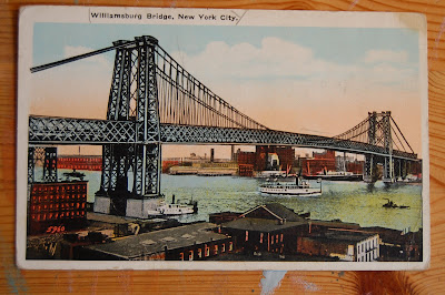
The second card shows : Williamsburg Bridge.

The printed text says: " Williamsburg Bridge crosses East River from Delancey and Clinton Streets, Manhattan, to Broadway, Brooklyn. Is a combine cantilever and suspension bridge. Opened Dec. 19, 1903, cost 10 million dollars. Crossed daily by about 400,000."

These two bridges are beautiful examples of good engeneering. Funny though that this last one is the oldest of these two. I would have guessed it the other way around.


My third card today shows : Elevated Railroad Curve at 110th Street, New York.
The printed text says :" Elevated Railway Curve at 110th Street; at this point the elevation is higher than in any other part of the city. Reaching a hight equal to five stories and requiring elevators at the station to take up and down the passengers. New York City is famous for it's elevated railroads; this is one of the most noted sections."
It's quite special that the people back then saw the necessity to lift the traffic up high. Well, in my head it is.
You can read a very old article about the elevated railroads here.


The last image today shows : Municipal Ferries and Lower New York.
This card doesn't have any printed text on it, so I can't tell you any more about it. I couldn't find any article to show you since I couldn't be sure if it was the right one I'd found.


Hope you've enjoyed it.
Have a nice day and take care.

Tuesday, August 23, 2011

Two girls today.

Good morning!

Headscarves are safe when the hair feels like a problem. This girl was done very quickly. I only used one hour alltogether.
I'm writing this August 22nd and don't know yet what to paint today. This girl was drawn before painting. My 20th girl was made without a single pencil line and I feel it's not the time yet to make another one that way.

It's all about learning with this project and learn I do all the time. It seems like a never ending story and it probably will be too.
I have a lot more to learn about light and shadow so I might go back to use some photos as inspiration. One do decide from where the light shines but it's not always easy to tell where the shadows appears. At least not for me it isn't.


My face # 20

This is my first painting done without any drawing in beforehand. I strongly wanted to try it, but I'm not sure whether to do it again. My painting today is not good, but when I studied it for a while it's not just bad either. When I asked my husband about this one, he didn't like it at all. He felt it was made by a child.

OK, perhaps I'm too kind to myself when I say that I don't think it's that bad. I feel that the old lady has very living eyes. Yes, I do see that her nose and mouth looks funny but in a little distance it's not that bad after all.

She is an old lady and the whole painting express that. She can even look a little confused, or lost or something. This is my first without drawing and I had luck to even get her that "good", but I don't think it's time for me to do it this way yet. So I'll have to see what I want to do this week.


That's about all I had to say so I wish you all the best.

Monday, August 22, 2011

A wedding.

Good morning to you.

This weekend we were celebrating a wedding. It was a wonderful day and a celebration quite extraordinary.
At the Church the sister of the bride sang them (the bride and her father) in. That was very nice and touching. After the ceremony we (the guests 125) assambled in their private garden and was treated with fingerfood and champagne.
In a while the bride and groom and their parents came by horses. Just like in old times. Walking in front of the parade was the brides brother and his girl dressed in Bunad, then came a carriage with a musician in it. (he was playing a saxophone) In the next carriage was the newwedded. Their parents walked alongside waveing their flags. Both the carriages and the horses was decorated with beautiful flowers. It was indeed a breathtaking sight.
Later on we were seated in a huge partytent and served a three course dinner. There were a lot of speaches but the brides father was the most astonishing.
Since he so easily get emotional he had decided to sing the bride a song instead of a traditional speach. With a little help from his oldest daughter he sang a very touching song called "I loved her first"
The food and wine and everything was so tasteful and beautiful arranged. I think that most of the guests won't forget this evening for a long time, and my husband and I won't forget it ever since it was our weddingday too. Our 34th.


I had to make a journal spread for this occation.
What have you been up to this weekend?

Sunday, August 21, 2011

Yeah....this is a fun way.

Yet another "few colours" painting.

Good Sunday morning everyone!

I feel I can do it this way. Todays painting holds 3 colours only + my drawing pencil to outline. The colours used are: Black, white and raw sienna.
It feels a bit confusing to start with but even at my second try I felt it worked better. This time I started with the background, I painted the whole sheet the shade I wanted. I'm still dependent to the drawing and that irritates me a bit so I'll try at some stage not to draw the image before painting it. Well, at least just to draw it loosely. On this one I even painted the eyes with acrylics.

I really have improved, now I draw an image in half an hour and the painting is mostly done in an hour. To start with I used 3-4 hours at the whole process. So, it helps to practice in many ways.

What I like the most in this painting is that the background shines through the face. I feel I have gained another depht by that. What I don't like that much is that the highlights seems a bit too blue. I didn't mix my own black and perhaps the black I have contains too much blue in it. I don't know, but I will try to mix my own next time to see if that changes.
Her hair has something unnatural about it too, something about the outlines. Perhaps it would look better with a more diffuse outline.


For me this is an interesting face. It's not about beauty, but expression. I'm definitely on my way to something that can be "my way" of doing it. I do need to practice faces in other angles than stright forward though.

Wish you all the best.

Saturday, August 20, 2011

My 18th but still the first.

I tried something new.

This is my 18th face, but my first male face and my first try of a new way of doing it. I don't know if this is how I'm going to do it, but I feel it came out quite good and not far from what I had imagined.
I liked to use just a few colours and I see it can work well. I have to practice to get used to do it this way and I certainly will. It's something quite different from what I've been doing and that is like a new inspiration to me.

The colours I used on this painting was: Cobalt blue, burnt sienna, raw sienna and of course titanium white. I did a mix of the three first and used the white to lighten that coolour in different shades. Finally I used a black pencil to outline the image. You should give it a try, it's fun to see how different it is to paint and make it look good with a limited palette.

The shadowing in his face is far from good but this was my first time. I promise to do it better next time. The shadow "behind" him is just luck. I didn't pay that any attention at all.


Please don't look too close to the details, his ear, eye and mouth, they could have been far better but for me it was important to try this out and not be afraid of trying it.

I used my stones for the first time today. They are really nice and it was not that difficult to crochet around them.

I wish you all the best and enjoy your weekend!

Friday, August 19, 2011

I'm struggling


I'm starting to loose interest.

Hello everyone!

It's not that I'm giving it up, but now I feel all my faces looks the same. I have to do it differently. I have been thinking of withdrawing from " the natural look" and turn into a more "my own way" of expression. The problem is HOW do I do that? That's the question I have to find an answer to. And what is my own way....is the next question. Well, time will show. I have some thoughts and I will try them out to see if it works. Amongst other tings I'll try to reduse my palette, or perhaps limit it to a couple of colours. It feels frightening and unsecure to even write it down, but perhaps it's easier than I'm thinking at the moment.

Todays girl has my hair, but she's not a selfportrait. If she were I have given myself a huge facelift. :-)
Her right eye seems to pop out of the scull. I always tend to make the eyes too big so I'll have to pay attention to that.


I'm not sure when to start my experimentation but it will be soon. At first I was thinking of not showing them (new things) off, but I think it's a great way of documenting a process don't you agree?
Well, enough bla, bla, bla...
Have a nice day and take care.

Thursday, August 18, 2011

My 16th face.

Today I'll show you my painting step by step

Today I want to show you how my faces are made.
This first image shows the final drawing, as I imagine it to be. I'm thinking of painting a child wearing a cap and a jacket with fur edges.


This is how it looks with the first layer of paint.


Second layer of paint.


Third layer and some shadows. At this stage I can see that this child is not going to look as young as I wanted, and therefor I start looking for an alternative.


Fourth layer of paint and some highlights. I did regret the shadows at the cheeks so I removed them. I also chose to change the clothes into a cape with a hood instead of what I first thought of. This solution seems to fit better to this child.


I changed the hood a bit and added some colour to the face. Eyes, mouth and painted the fur.


This is the final result, I can see that the highlights are not that well done in this one but I chose not to change that. The child is now somewhere between 8 and 12 years old instead of 2 to 4 as I was thinking of to start with.


It is very exiting to do these faces and to see how they turn out. I'll have to practice small children to learn the differences in the lines. Children are very different in every way and I want to learn about it.

I hope you've enjoyed my journey with this one and how things can change during the process.

Have a nice day and take care everyone.

Wednesday, August 17, 2011

It's time for a cityview again.

Three new images from old NY.

Today I'll show you three impressive buildings. Impressive if one take into concideration how old the buildings are.

The first card shows: Municipal Building
When I enlarge this photo on my computer it looks like there are 22 or maybe 23 statues on top of the row of pillars. To me it looks like a giant building. This is what is printed at the reverse:
" Municipal Building, New York. Covering a city block, Park Row, Chamber and Centre Sts. 34 stories, 585 feet high, built by the City of New York under Mayor Gaynor, to be used exclusively for offices of city departments."

There are no such beautiful buildings built today so I do hope this one is still excisting.


The second card shows The Equitable Building.

Compared to the building above this one looks quite modern. When I see these images I think it's no wonder so many of my fellow countrymen imigrated to America. At that time these images must have expressed "heaven". This specific image is dated to 1913. You can see it at the bottom line, written in white.
The printed text says:
"Equitable Building, New York. Largest Business Structure in the world. The Equitable Building will occupy the block bounded by Broadway, Nassua, Pine and Cedar Streets, it will be 38 stories above ground and 3 below, with a floor space of nearly 45 acres. It will house 15.000 people, and will have many of the departments of the city government. It will cost $ 29.000.000"
Was it ever build?
It's a very impressive sight though when we know how old it might be.


The last card today shows Singer Building and part of financial district.
This is my favorite of todays cards. Look at that view!! And notice the people far down there. The flying flag and the water in the background also contributes to make this card my fav.

Listen to the printed text:
"Singer Building located on the corner of Broadway and Liberty Streets is 47 stories high rising to a total hight of 612 feet. In it are 5.000 tenants, who are carried to their offices by 16 Otis traction elevators. The foundations consists of 36 caissons sunk to bedrock 92 feet below surface. Built by the Singer Mfg.Co."

This image is copyrighted in 1912 by Irving Underhill.
Where the stamp is ment to be, there is a text saying: "United States and Canada one cent. Foreign two cents." Well, those were the days!


That was all for today, but I have new images to show you next week.
Wish you all the best.

Tuesday, August 16, 2011

This one is a bit scary.

My 15th face is pure imagination.

Hello and welcome back!
I'm awfully glad for all of you who visit and comment on my blog. Thank you so much for that!

This is the first face this week and I really felt the pressure with not using a photo as inspiration. Therefor I felt for doing a "hidden" face.
When I look at her now, she reminds me a lot of one of my nieces. Especially her eyes are the same.
All her stash doesn't have any other meaning than to help hiding her face a bit. She feels a bit scary to me.
In the first place I thought of doing some kind of carnival outfit, but it doesn't look like that either.
As you can see I skipped her ears, and I'm thinking they are hidden behind the facemask.
I don't have much more to tell you about her, so I'll stop with this.


Tomorrow there will be another tour in old New York.
Untill then.

Monday, August 15, 2011

Little Sunday princess.

Say hello to my sweet little Sunday-princess.

Good morning.

I had my doubts about this painting. I've tried so many times to draw a child but I find it very difficult. But I did it this time, yay!!

This was made on day 14 so now I'm soon half done. I am really amazed to see what I can do. ME!!? I had no idea of this before now. I think it was because of Norah's blog. Not that much what she does but HOW she does it. I really have learnt much of her way of mixing colours. And of course the fact that this is not a competition. I've kept asking myself what is the worst thing that can happen? The answer is NOTHING and that makes me much less afraid of trying things.
This painting was my last using a photo as inspiration at least for a week. Coming week I'll try to use my imagination when drawing and painting. I really look forward to that.

My girl today may not be the best in the world but she's MINE and I LOVE her. She has these "following eyes" too so I kind of feel she's a bit alive.
What I have learnt is that it all depends on the time spent. If I give myself enough time with each painting it will be good. (at my level that is) That way it can be a little drawback to decide one each day.


This girl is made by using acrylics and I don't know how many times I've been painting over her face. It's a wonder that I can't rip her off the paper in one whole piece. Besides acrylics I always use water soluble crayons to make the irises. I find it much easier to achieve that "glazy" effect by using them. She don't look like the girl I used as guidance at all. Of course the shape of her face and the angle are the same but it stops there. Perhaps next time I should show you my inspiration photo as well as the result.

Enough for today, I'm going to draw a new face, I just hope it will work for me even without a photo to look at. Take care!

Sunday, August 14, 2011

More faces and some music.

Faces # 12 and 13.

Hope you're all haveing a nice Sunday morning.

My painting from the 13th was inspired from both a photo and some music. I'm extremely pleased with how nice I got the colours blended in this one, but I'm getting a bit tired of all this beauty.
All the photos I use as inspiration are from fashion magazines and all the models are as beautiful as can be. The benefits are that there are no extra lines and saggy skin.
This girl is adverticing a special brand of lipstick, and as you can see the lower part of my painting is "torn out". That's where the written part in the ad was. Just as I was wondering what to do in that space I heard this music and knew I had to draw her shoe.

Parts of the lyrics goes like this: I'm lost in the tango, I lost all my fandango too. Drinking tequila from the señoritas shoe. Dancing on the tables, shooting for the moon while a thousand guitars are playing in tune.

Can you see why I had to make that shoe?


Take a few minutes to listen to this music. It's a well known Norwegian artist and these rhythms are really catchy. Enjoy!


My 12th girl.

This girl is posing and showing outfits. I really fell for the hat. I simply love the swirly lines of wide brimmed hats, but it don't help my training on faces much. I got to do this nose though, it's a bit unusual for me with a nose in this angle.
I shouldn't have made the white spots in the background uneven. I can easily see that I could have made it into buildings. Well..., done is done.


Just one more left before I start using my imagination again. I look forward to that.
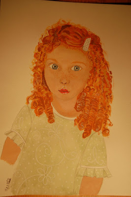
My last this week will be a little girl with very red and curly hair. I've tried several times to do children but it won't work so I'm quite courious if I can do it this time.

That's all for today folks, wish you all the best.

Saturday, August 13, 2011

Some art journaling.


Just something I did in my journal.

The first spread was my thoughts after the big disaster in Oslo a few weeks ago. I didn't feel for using colours at all and I think my spread can speak for itself.


This page shows a face I did in a hurry some days ago. One should think that my "one face a day during August challange" was more than enough faces but it's addictive. I find myself drawing/sketching small faces or parts of them all over. It's kind of testing things out. An eye in a different angle or a nose seen from below and even complete small faces.

This specific face is made using water soluble crayons and markers only. I had decided to try my waterbrush on a bigger surface. The brush is very good but the result is more wet than if I use a "normal" brush. I have a bit less control (UHA) but it's great when blending colours. All in all I like the waterbrush very much, but when I'm in need of control I wouldn't dream of using it. Making eyes for instance.


As I spoke about in an earlier post, I'm thinking of drawing without a photo as inspiration next week. I think it's important not to be too dependent of a photo, that would easily lead to limitations.

Enjoy your weekend everyone!

Friday, August 12, 2011

Two more girls.

Hello my friends.

Two more girls today. My 10th girl is a strange one. She was so mild and soft when drawn, and came out quite different when painted and done. She appears a bit stiff and looks very determined.
When I look at her now I see that there is few shadows, perhaps that plays a role. Besides that I did something in a hurry that I shouldn't have. It was just before I was going to serve dinner and : "just a minute I just have to....." I put a shadow line to her left side. (I'm lefthanded) I didnt bring my thoughts when I did it. The line itself is too dark and it's on the wrong side of her face.
Inspite of that I'm quite satisfied with her. At this point I have some finished girls to compare and I like them better with a painted background, I feel there's somthing missing without that.


This girl is mostly a joke. It's faces I'm making but I couldn't resist this one. So this model is showing fashion from back in time. Do you see the shoulder pads? Do you remember how we looked like? We were like wrestlers all of us.

I'm surprised how well the rose came out. I, honestly, didn't know that I could draw not to mention the painting. I'm really enjoying it.


Right now I'm in the phone at the same time as I'm writing this. I think it's better to just finish this off.
Wish you all the best.

Thursday, August 11, 2011

Two more girls. One dressed and....

Good morning to you all.

I had a quarrel with my 8th girl.
She insisted on wearing that outfit and that colour. She has knitted the hat herself and wouldn't follow my advice to hold it in her hand.

I was trying to draw a sideway profile and I'm not pleased. She looks a bit fun but take into concideration that she's showing us her back.
Her chin should have been shorter, her face should hold the same angle as her hat. Besides that she was good practice and I learn the most of those who is not that good. I really feel that I'm improving, I use less time to draw and certainly less time to paint. All in all I feel that my daily drawing/painting is useful when talking about learning.
Next week I think I'll draw without a photo as a guideance. Well, I'll have to see.
I'm still struggleing with drawing the hair, but I'm practicing. The other day I baught my first canvas ever. I placed it besides my desk and it'll have to wait. It feels much too scary to start painting at.


My # 9 girl.

I was a bit uncertain whether to show this one off. One can never know if anyone out there will feel offended. I apologise if someone do.
When I first saw this girl (photo) I fell for the image. An angled face with a loooong neckline, which I really like. All the light in this one was tempting too. To be short, I couldn't resist the temptation.
This girl is adverticing for a "must have" bodyoil. (15 years ago) I remember when I was a child there was this painting in many homes. That girl had a red dress on but her posing was almost the same as mine. Today that painting is very attractive in antique fairs.
The skintone is still a challange for me. All my girls do have different skintones. The one above has the whitest tone of them all, but I think it works.


I'm glad I tried this one because I learnt a whole lot about the light and how to deal with it. It felt quite odd with all that white at her shoulders but it's all the same correct and it works well.
Enough for today, new challenges are sitting on my desk waiting to be handled.
Take care.

Wednesday, August 10, 2011

Another tour in NY

Ready for some more pictures from old New York?

The first card shows: Hall of Fame. University Heights.

The card doesn't have any dating but I assume it's made between 1910 - 1920. That building looks quite modern to be of that age. There's nothing printed at the reverse so I can't tell you any more about it.


The second card shows: Columbia University. I wonder how the neighbourhood looks like today. There is a printed text on this one saying:
"Columbia University occupies an area of 26 acres from Broadway to Amsterdam Avenue West, and 114th to 120 Streets. Was originally founded as Kings College in 1754 at Broadway and Barclay Streets. Moved in 1857 to Madison Avenue and 45th street. New buildings on present site were erected between 1892 and 1902 at a cost of $ 13.000.000. Endowment $ 29.000.000."
Isn't it amazing with the empty streets?


The last card for today shows: The Obelisk, Central Park.
This card looks so peaceful, and have a look at the car. Printed text says: " Obelisk Central Park. This is a 200 ton monolith brought from Egypt in 1880 and said to be 3400 years old. It, therefore, is a great curiosity, not only on account of it's age, but also because of the Egyptian hieroglyphics written thereon."

Is it still excisting, I wonder.


That was all for today, I hope you've enjoyed it.
Have a nice day and take care.

Tuesday, August 9, 2011

Girl # 7 and a bit more.

My painted face today is not as "perfect" as I would like it to be BUT she's the first one of my girls that has the nerve to look me stright back in my eyes. I really like that.
Many many years ago I learnt how one could decide if the eyes were "correct" or not. What I learnt was: I place my object (painted girl) in a distance and I myself move around in the room, if I can feel that the eyes are looking at me from different angles they are so called correct. This one does that. Ofcourse the girls need to look stright into the camera to achieve this effect. The hardest thing is to get both eyes focusing at the same point, and if not it won't work.

I was learning to make handmade and handpainted dolls at the time, and our teacher showed us one correct and one that wasn't. It's easy to see if one know about it. I have been too focused to pay attention to this with my girls so it felt very good when it happened now. It's almost like one can spot a bit of their soul.


This girl was my first using a photo as a reference. My girl don't look like the one in the photo, not even close. I used the photo just as reference to the angles and things like that. I can't decide whether she's a fashion freak or if she's ready to milk her cows. What do you think?
Her expression is something like: did you notice what I did, hope you didn't.

I always see something to change when the painting is done so perhaps it would be smart to draw one day and paint the next. That way I could study my drawing for a while and do the changes before paining them. How do you do it?

¨¨*¨¨*¨¨*¨¨*¨¨*¨¨*¨¨*¨¨*¨¨*¨¨*¨¨*¨¨*¨¨*¨¨*¨¨*¨¨*¨¨*¨¨*¨¨*¨¨*¨¨*¨¨

I was trying a new tool one evening and it's good. Have you tried a water brush? One fills it with water and use it on top of water soluble crayons. The brushtip is very fine but soft so it takes a bit of time to get used to it. It worked so well for me the one time I've tried it that I will certainly try it again. I see that it can be useful for blending colours.
I've used it on the "bricks" in my journal.


This is the brush, and it's filled with water.


Enough for today, I have a drawing job waiting.

Wish you all the best.

Monday, August 8, 2011

Girl # 6 / 31

My best so far.

Hello out there.

Well, the vacation is over and things back to normal again. We've had a nice and useful time at home. Cleared out a lot of old stuff and get rid of it.

I'm very satisfied with todays painting, and I can hardly understand that I've made this. Ofcourse I could point out some things that I wish was better, but I won't. One can't have it all.
I spend quite some time on the drawing because I'm not that familiar to the shapes to just paint without a good drawing first. I believe this girl lived in my pencil and wanted to come out, it almost did itself.
My biggest "fear" is to start painting, I'm scared to ruin it all. Funny thing though since I've experienced that most things can be fixed.

The blog Clare told me about , All Norahs art, has been very useful. For mixing colours and to watch her paint. Thanks a lot again to Clare. I really recommend you all to have a look at her Morning art videos.

When it comes to hair I'm struggleing. I like it much better when the hair is assembled in some way or other. Natural downhanging hair is very difficult to paint.
So that's why my girls have all these strict hairstyles.
Todays girl was painted Saturday.

Yesterday I did my first face in a different angle so I had to use a picture as a reference. I find it very difficult to draw a sideway face, but I'll just have to practise.


I find it very exiting each day to draw a new face. Who will I meet today? Most times I'm struggleing at the beginning but all of a sudden it just happens, that's why I like it so much.

Wish you all the best.

Sunday, August 7, 2011

Girl # 5, Very pleased and not.

Todays girl looks familiar to me.

Hello friends.
This girl looks familiar to me but I don't know who she is. It might be a former customer she reminds me of. I really feel connected to this painting even though I messed it up. There's something wrong. The photo below shows her before I messed her up. I could have tried to fix her but there's something about just going on.
Today I can see that I could have done sommething about the shadow spot under her nose and strighten out her nose a bit. I think that would have done it.


Instead I painted a new mouth and all went wrong. She looks weird. I did fix a little on her hair because of the shape of her face. My husband pointed at her right shoulder and asked me if I couldn't see it was different from the other one. I had to please him and made a wrinkle on her top as an excuse.(funny thing about my husband, he's so symmetrical.)


Although she looks weird I like her and her fragile looks. I would love to know who she really is. Perhaps I should ask Olaug, my former colleague, if she recognice her.
The girl I'll show you next is my best so far. (From my point of view)
From Monday I'll have to draw faces from another angel, I believe in variation and need it too.
I hope you enjoy this as much as I do.

Wish you all the best.